Where this fits: classification, regression, clustering
Every procedure in this part of the book starts from a table: rows are instances, columns are features. The first question is always whether one column is singled out as the label: the quantity we want to predict, and one that is known for the rows we already have (the ground truth).
If there is a label, we speak of supervised learning: we learn the relationship between the remaining columns and the label in order to predict it for new rows. If the label is on a nominal scale (species, colour, yes/no), the task is called classification; if it is continuous (price, temperature), it is called regression. Formally, classification is a special case of regression; in practice it needs one extra idea to turn real-valued predictions into classes (the keyword is logistic regression, the central model of the course Introduction to Deep Learning).
If there is no label, we speak of unsupervised learning. Clustering invents the label: it divides the rows into groups, and the group number is a new column that was not there before. Such an invented, unobserved column is called a latent variable. The unsupervised counterpart of regression is feature engineering, that is, computing new columns from old ones (the principal components in the chapter Dimensionality reduction, for instance). The most general unsupervised goal is to learn the distribution of the data itself; such a generative model can then produce new rows (the chapter Expectation Maximization).
The most important practical difference is the assessment: in supervised learning you know the label and can hold back some of the rows and count the predictions on them (train-test split, the chapter Model selection). In unsupervised learning there is nothing to count; whether a clustering is “good” is a matter of plausibility, or of a summary measure chosen after the fact.
| Task | Label | Example in this book | Chapter |
|---|---|---|---|
| Classification | nominal, known | predicting the iris species from four leaf measurements (example below); recognising items of clothing on Fashion-MNIST | Model selection, Kernel methods |
| Regression | continuous, known | predicting the price of a house in Melbourne from its location and size | Regression analysis |
| Clustering | none, it is invented | dividing iris instances into three groups without their species | this chapter, Expectation Maximization |
A one-line classifier that also builds the bridge to regression: for the iris data, the rule “petal length under 2.5 cm, then setosa, otherwise not” predicts the species setosa without a single error. That is a threshold on one feature; logistic regression learns exactly such thresholds, but from several features at once.
Let us check this with the confusion matrix from the chapter Titanic EDA:
import numpy as np
from sklearn import datasets

iris = datasets.load_iris()
petal_length = iris.data[:, 2]
truth = (iris.target == 0)            # ground truth: is it setosa?
prediction = (petal_length < 2.5)     # the rule

tp = np.sum( prediction &  truth); fp = np.sum( prediction & ~truth)
fn = np.sum(~prediction &  truth); tn = np.sum(~prediction & ~truth)
print("Confusion matrix [[tn, fp], [fn, tp]] =")
print(np.array([[tn, fp], [fn, tp]]))
print("Accuracy =", (tp + tn) / len(truth))
Confusion matrix [[tn, fp], [fn, tp]] =
[[100 0]
[ 0 50]]
Accuracy = 1.0
Not a single mix-up, accuracy 1; the rule “women survive” on the Titanic only reached 0.79. The iris data are a textbook example, after all.
We begin with clustering, because k-means is the simplest procedure that shows all the building blocks of machine learning: a model with parameters, an optimisation objective and an iterative algorithm.
k-means is an unsupervised learning procedure for dividing a dataset into clusters. Depending on the shape of the data, k-means may already be enough for a classification or a predictor, or it may be the starting point for more complicated algorithms. Here is the number of clusters, and it has to be fixed in advance. There are heuristics for finding the ‘optimal’ ; one of them is to start at and look at plots of the clusters until you are satisfied.
First we go through the idea in pseudocode, taking the petal length and petal width columns of the iris data as the example, that is, in with :
We fix a , the number of clusters. In the iris example: 3
We fix distinct points , the ‘centroids’. These can be restricted to points of the dataset, chosen simply by drawing uniformly at random.
For every other point we compute which centroid is nearest and assign to group .
Then we update the -th centroid to the mean of all points in group . If nothing (or little enough) changes in the process, we are done.
One k-means iteration
import numpy as np
np.random.seed(2222)
import matplotlib.pyplot as plt
from sklearn import datasets

iris = datasets.load_iris()
# permute the data to make it look less sorted by class already:
permutation = np.random.permutation(np.arange(len(iris.data)))
x = iris.data[permutation]
classes = iris.target[permutation]
k = 3
demodata = x[:, 2:4] # petal length, petal width
random_indices = np.random.choice(len(demodata), k)
initial_cs = demodata[random_indices]
cs = np.copy(initial_cs)
print(cs)[[4.5 1.5]
[1.3 0.2]
[6.1 1.9]]
def plotinit(the_data):
    fig, ax = plt.subplots(figsize=(6,6))
    ax.set_xlim(np.min(the_data[:,0])-0.2, np.max(the_data[:,0])+0.2)
    ax.set_ylim(np.min(the_data[:,1])-0.2, np.max(the_data[:,1])+0.2)
    ax.set_xlabel("Petal length")
    ax.set_ylabel("Petal width")
    return fig, ax

fig, ax = plotinit(demodata)
ax.scatter(demodata[:,0], demodata[:,1],
           c=classes, vmax=k-1,
           alpha=0.4, s=20)
ax.plot(cs[:,0], cs[:,1],
        'P', c='black', markersize=10)
fig.suptitle("Random choice of the centroids")
plt.show()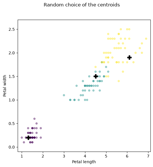
# We put the class guessed by k-means into a new column:
point_classification = np.full(len(demodata), -1.0)

# We keep a history of the centroids for plotting:
cs_history = np.full((len(demodata),k,len(demodata[0])), -1.0)

# Point by point, everything gets classified:
for i, point in enumerate(demodata):
    # Determine the nearest centroid:
    distances = [np.linalg.norm(centroid - point)
                 for centroid in cs]
    pointclass = np.argmin(distances)
    point_classification[i] = pointclass
    # In this first pass we recompute the
    # centroid immediately, not only
    # once the pass is over:
    cs_history[i] = cs
    cs[pointclass,:] = np.mean(demodata[point_classification == pointclass],
                              axis=0)

# Look at the results:
fig, ax = plotinit(demodata)
ax.scatter(demodata[:,0], demodata[:,1],
           c=point_classification, vmax=k-1,
           alpha=0.4, s=10)
ax.plot(initial_cs[:,0], initial_cs[:,1],
        'P', c='black', markersize=10, alpha=0.4)
ax.plot(cs[:,0], cs[:,1],
        '+', c='black', markersize=20)
fig.suptitle("Centroids and clusters after one run of 3-means")
plt.show()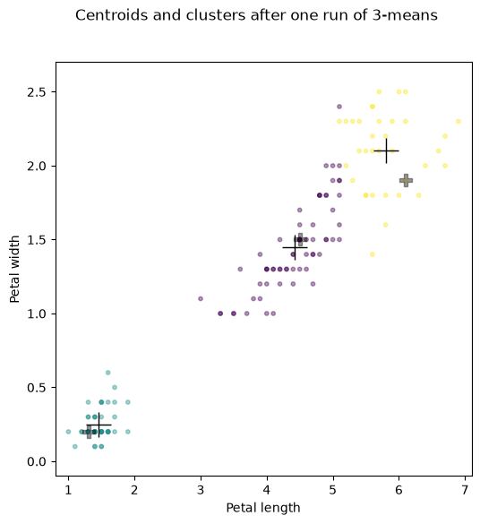
# The class names are permuted;
# for a better visualisation we 'repair' that,
# and then the colours match the original classes:
point_classification[point_classification == 0] = 3
point_classification[point_classification == 1] = 0
point_classification[point_classification == 3] = 1
You can also watch at leisure how the algorithm clusters the points step by step:
import matplotlib.animation as animation
from IPython import display as ipydisplay
import io, base64

fig, ax = plotinit(demodata)
fig.set_size_inches(9, 9)

def init():
    ax.scatter(demodata[:,0], demodata[:,1],
           c=classes, vmax=k-1, alpha=0.2, s=200)

def update(i):
    ax.clear()
    init()
    ax.scatter(demodata[:i+1,0], demodata[:i+1,1],
               vmax=k-1,
               c=point_classification[:i+1],
               marker='s', s=50)
    ax.plot(cs_history[i,:,0], cs_history[i,:,1],
        '+', c='black', markersize=30)

ani = animation.FuncAnimation(fig, update,
                              frames=len(demodata), interval=100,
                              init_func=init)
video = ani.to_html5_video()
# Also output the last frame as a PNG: the web export shows the video,
# the PDF export (which cannot do HTML) uses the still image.
png = io.BytesIO()
fig.savefig(png, format='png')
ipydisplay.display({'text/html': video,
                    'image/png': base64.b64encode(png.getvalue()).decode('ascii')},
                   raw=True)
plt.close()What we see here is that we can run the procedure a second time, with the new centroids as the starting centroids, and get a better clustering. If the clusters (and hence the centroids) stop changing under repeated runs, we speak of convergence. Using the full dataset (not just 2 columns) of course gives better clusters. What we want now is a method that performs one k-means pass on an arbitrary dataset with given initial centroids. While we are at it, we can replace the previous implementation by a vectorised one:
A vectorised k-means implementation
def kmeans(data, k, centroids):
    alldistances = np.array([np.linalg.norm(data - centroid, axis=1)
                             for centroid in centroids])
    assert alldistances.shape == (k, len(data))
    point_classification = np.argmin(alldistances, axis=0)
    new_centroids = np.array([np.mean(data[point_classification == pointclass],
                                      axis=0)
                              for pointclass in np.arange(k)])
    return point_classification, new_centroids

point_classification, new_centroids = kmeans(demodata, 3, cs_history[-1])

# Look at the results:
def plotinit(data, col1=0, col2=1):
    fig, ax = plt.subplots(figsize=(10,10))
    ax.set_xlim(np.min(data[:,col1])-0.2, np.max(data[:,col1])+0.2)
    ax.set_ylim(np.min(data[:,col2])-0.2, np.max(data[:,col2])+0.2)
    ax.set_xlabel("variable %s" % col1)
    ax.set_ylabel("variable %s" % col2)
    return fig, ax

def plot_results(data, k, centroids, classes, col1=0, col2=1):
    fig, ax = plotinit(data, col1=col1, col2=col2)
    ax.scatter(data[:,col1], data[:,col2],
               c=classes, vmax=k-1,
               alpha=0.4, s=10)
    ax.plot(centroids[:,col1], centroids[:,col2],
            '+', c='black', markersize=20)
    fig.suptitle("Centroids and clusters (columns %s,%s) after running %s-means" % (col1, col2, k))
    plt.show()

plot_results(demodata, 3, new_centroids, point_classification, col1=0, col2=1)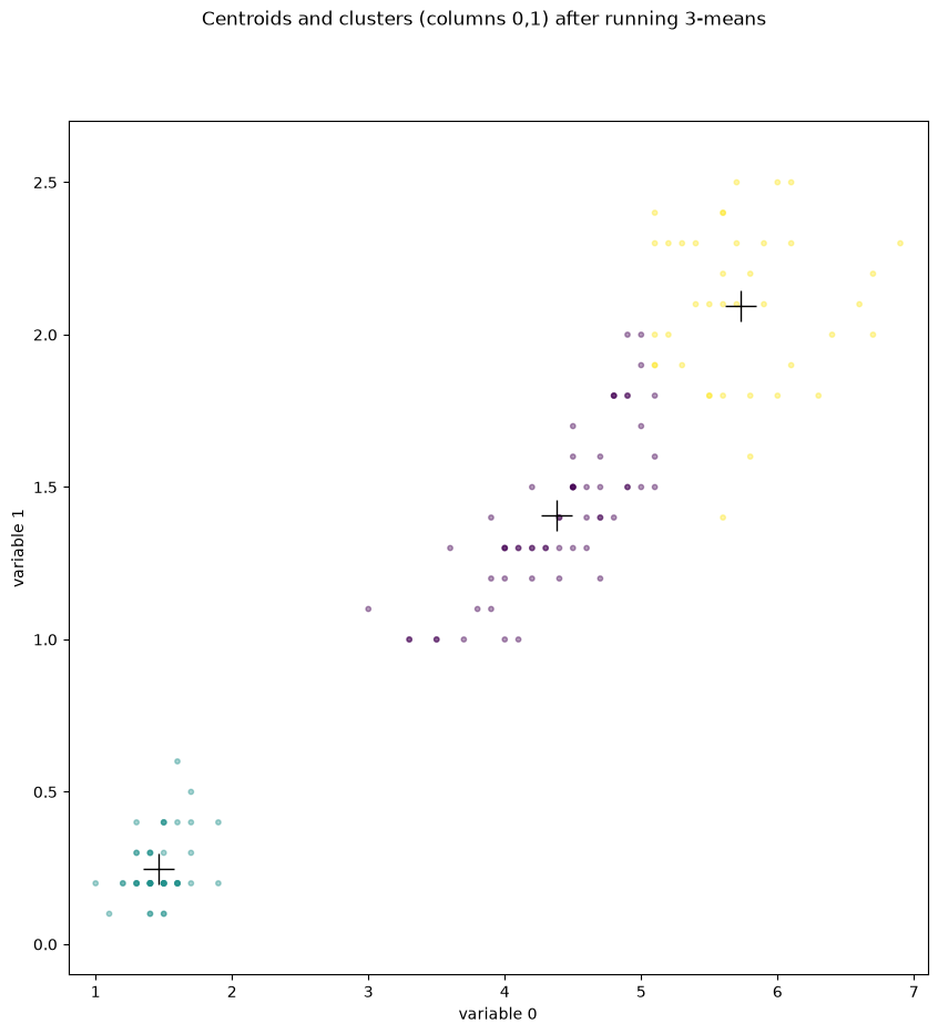
# Because it is so easy now:
k = 5
data = x # sepal length, sepal width, petal length, petal width
random_indices = np.random.choice(len(data), k)
initial_centroids = data[random_indices]
point_classification, new_centroids = kmeans(data, k, initial_centroids)
plot_results(data, k, new_centroids, point_classification, col1=2, col2=3)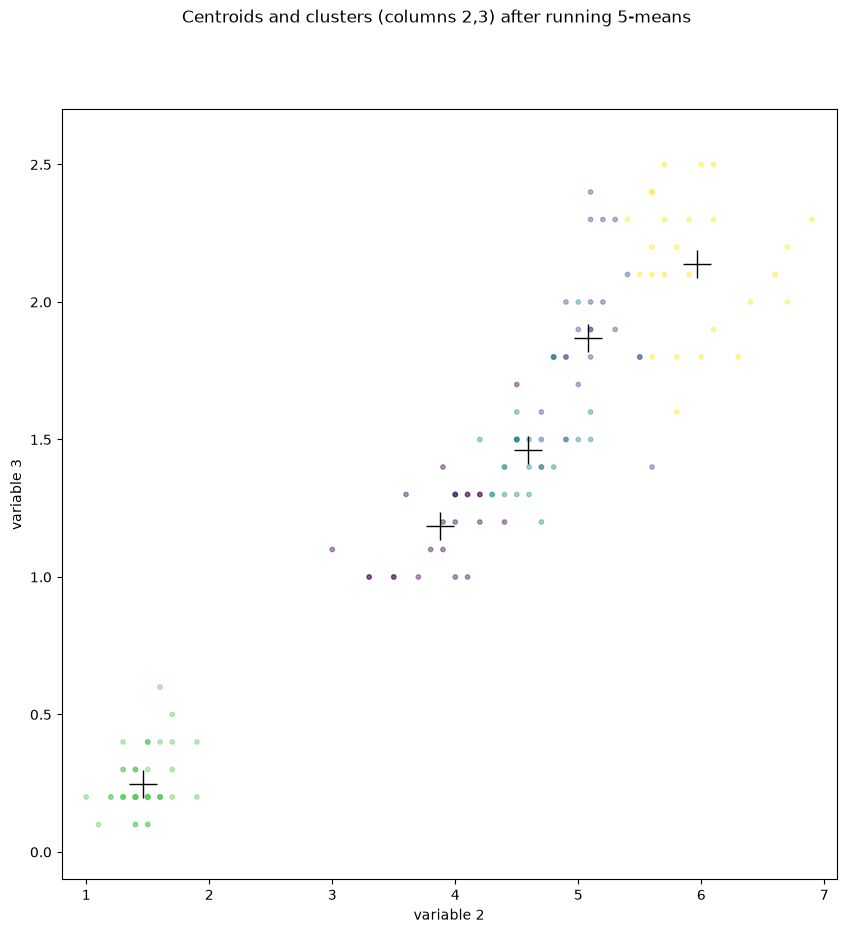
A converging k-means implementation
np.random.seed(2222)

# 3-means up to convergence:
def convergent_kmeans(data, k, breakloop=100, noisy=True):
    random_indices = np.random.choice(len(data), k)
    new_centroids = data[random_indices]
    old_centroids = np.full(new_centroids.shape, 0) # will be overwritten anyway
    point_classification = None
    i = 0
    while(not np.allclose(old_centroids, new_centroids, rtol=0.0001) and i < breakloop):
        i += 1
        if(noisy):
            print("iteration step ", i)
        old_centroids = new_centroids
        point_classification, new_centroids = kmeans(data, k, old_centroids)
        # if any of the new centroids is NaN, need to replace it by the old one to continue
        # this can happen if centroid is so bad, the empty cluster forms (=> no mean)
        nan_centroids = np.isnan(new_centroids).any(axis=1)
        new_centroids[nan_centroids] = old_centroids[nan_centroids]
    return point_classification, new_centroids

point_classification, new_centroids = convergent_kmeans(data, 3)
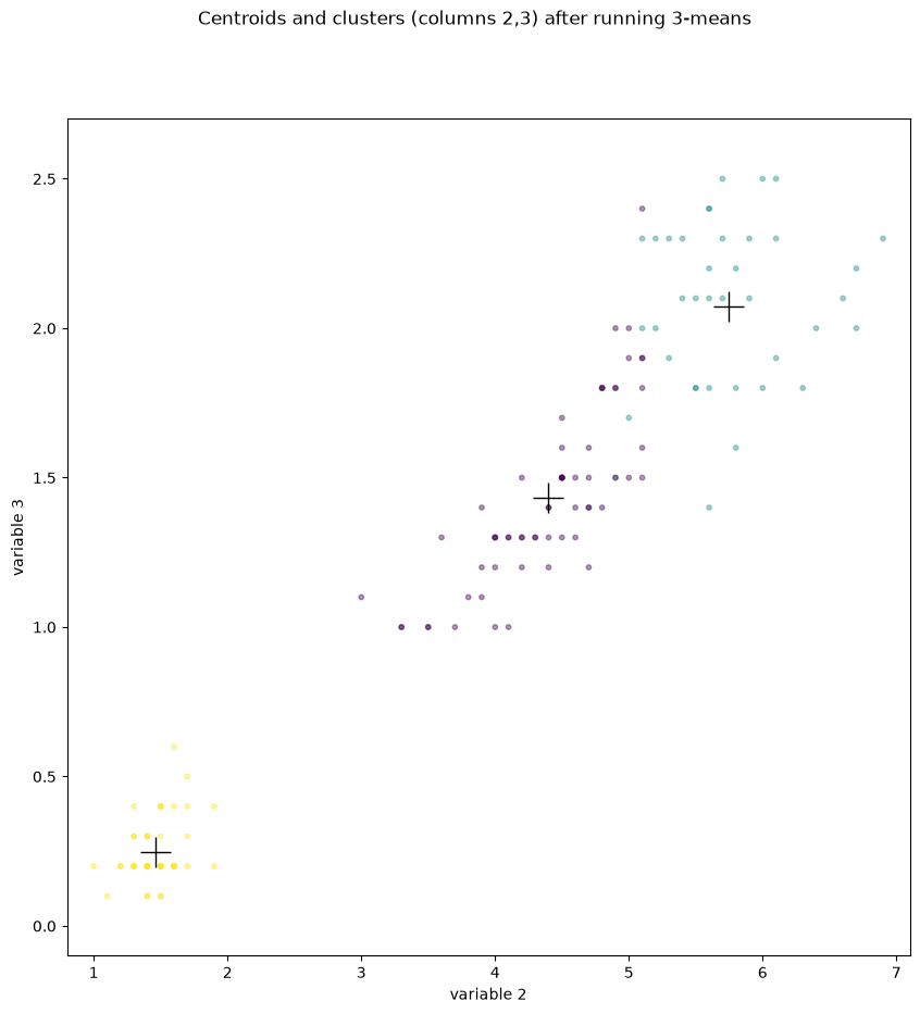
plot_results(data, 3, new_centroids, point_classification, col1=2, col2=3)
iteration step 1
iteration step 2
iteration step 3
iteration step 4
iteration step 5
iteration step 6
Which k is the right one?
np.random.seed(11111)
max_k_to_try = 20
assert max_k_to_try <= len(data)

import warnings

elbow_values = []
with warnings.catch_warnings():        # only for this loop: suppress "Mean of empty slice"
    warnings.simplefilter("ignore")
    for k in range(2, max_k_to_try+1):
        #print("looking at k =", k)
        point_classification, centroids = convergent_kmeans(data, k, noisy=False)
        # Compute the inner variance of every cluster:
        total_inner_variance = np.nansum([np.var(data[point_classification == pointclass])
                                          for pointclass in range(k)])
        group_variance = np.var(centroids)
        elbow_values.append(group_variance / total_inner_variance)

fig, ax = plt.subplots()
ax.plot(np.arange(2, max_k_to_try+1), elbow_values)
plt.show()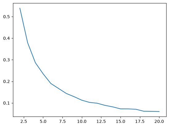
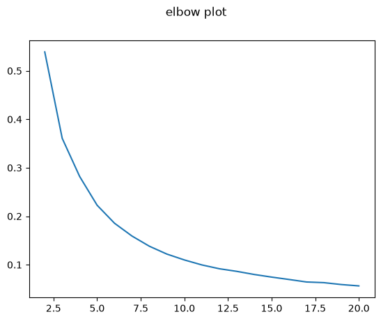
Robust k-means and the elbow plot
def robust_kmeans(data, k, howmany=20):
    score = 100000000
    for i in range(howmany):
        point_classification, centroids = convergent_kmeans(data, k, noisy=False)
        total_inner_variance = np.nansum([np.var(data[point_classification == pointclass])
                                          for pointclass in range(k)])
        group_variance = np.var(centroids)
        new_score = group_variance / total_inner_variance
        if(new_score < score):
            final_classification, final_centroids = point_classification, centroids
            score = new_score
    return final_classification, final_centroids, score

with warnings.catch_warnings():        # as above: empty clusters produce "Mean of empty slice"
    warnings.simplefilter("ignore")
    elbow_values = [robust_kmeans(data, k)[2] for k in range(2, max_k_to_try+1)]
fig, ax = plt.subplots()
fig.suptitle("elbow plot")
ax.plot(np.arange(2, max_k_to_try+1), elbow_values)
plt.show()
An example with different data
import scipy.stats as st

def rings(n, radius=(8, 9)):
    rs = st.multivariate_normal(mean=radius[0]+np.ptp(radius),
                                cov=np.ptp(radius)/2
                               ).rvs(size=n)
    phis = st.uniform.rvs(size=n) * 2 * np.pi
    x, y = np.cos(phis), np.sin(phis)
    return (rs * np.stack([x, y])).T

n = 10000
sample = rings(n)
secondsample = st.multivariate_normal.rvs(mean=[0,0], cov=np.eye(2), size=n)
fig, ax = plt.subplots(figsize=(7,7))
ax.scatter(sample[:,0], sample[:,1], alpha=1000/n)
ax.scatter(secondsample[:,0], secondsample[:,1], alpha=1000/n)
plt.show()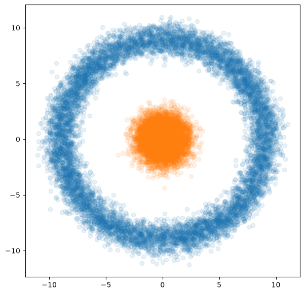
merged_sample = np.concatenate([sample, secondsample])
final_classification, final_centroids, score = robust_kmeans(merged_sample, 3, howmany=10)
#final_classification, final_centroids = convergent_kmeans(merged_sample, 3, breakloop=100, noisy=False)
fig, ax = plt.subplots(figsize=(7,7))
ax.scatter(merged_sample[:,0], merged_sample[:,1], alpha=0.1, c=final_classification)
plt.show()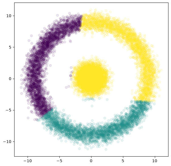
kmeans++
To counteract the problem of bad initial centroids, you can use the kmeans++ algorithm:
Choose a first centroid uniformly at random among all the data points
For every point , compute , the distance to the nearest centroid
Choose the next centroid from a weighted distribution that picks each with weight proportional to .
Repeat steps 2–3 until centroids have been found.
Ordinary k-means up to convergence
def kmeanspp(data, k):
    centroid_indices = [np.random.choice(len(data))] # uniform
    while(len(centroid_indices) < k):
        distances = np.array([np.linalg.norm(data-centroid, axis=1)
                              for centroid in data[centroid_indices]])
        smallest_distances = np.min(distances, axis=0)
        weights = np.power(smallest_distances, 2)
        # must normalize weights to sum up to 1:
        weights = weights / np.sum(weights)
        new_centroid_index = np.random.choice(len(data), p=weights)
        if(not new_centroid_index in centroid_indices):
            centroid_indices += [new_centroid_index]
    return data[centroid_indices]
centroids = kmeanspp(sample, 3)
point_classification, new_centroids = kmeans(sample, 3, centroids)
fig, ax = plt.subplots(figsize=(7,7))
ax.scatter(sample[:,0], sample[:,1], alpha=0.1, c=point_classification)
ax.plot(new_centroids[:,0], new_centroids[:,1],
'+', c='black', markersize=20)
ax.plot(centroids[:,0], centroids[:,1],
'P', c='black', markersize=10)
plt.show()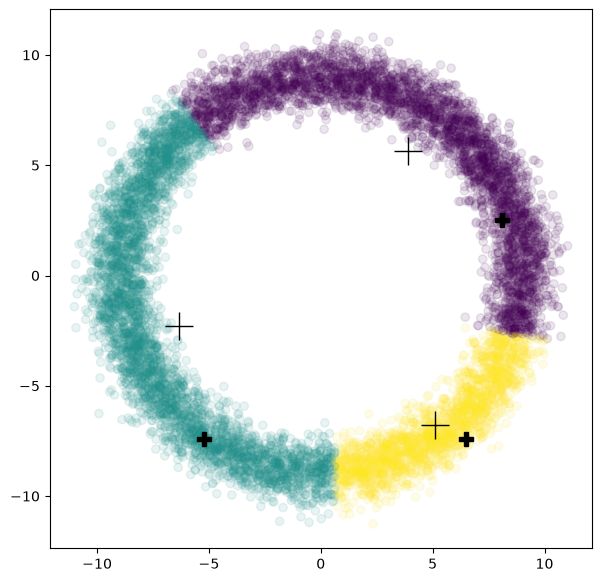
Trivia
A few more things worth knowing about k-means:
The average time complexity is in , with the sample size and the number of iterations.
The worst-case complexity is in , where is the number of variables (the dimension). Arthur, Vassilvitskii: “How slow is the k-means method?”, 2006
What happens in theory? What gets minimised is the so-called inertia, the sum of the squared distances of all points from their nearest centroids, . That also points at the biggest problem: when the clusters are not convex and homogeneous, this is a less sensible thing to optimise. The curse of dimensionality bites here too: in high-dimensional spaces distances behave unintuitively – points drawn uniformly from a ball, for example, lie near the boundary more often than near the middle. One more reason to learn about principal component analysis.
The bisecting k-means variant: First 2-means, then one of the largest clusters is split with 2-means, and so on, until there are k clusters altogether.
The mini-batch k-means variant: A compromise between our first variant (the one with the animation) and the last one. It has great advantages for online data processing (streaming) and for large amounts of data in general.
For k-means procedures to succeed, the data need to fall into clusters of roughly ellipsoidal shape with similar variance. Examples where it can go wrong are plotted in the scikit-learn documentation.
The elbow criterion is not a sensible one. Details and alternatives have been discussed in the literature for years Schubert (2023).
k-means in scikit-learn
There is of course no need to reinvent the wheel: scikit-learn comes with k-means implementations of its own:
from sklearn.cluster import KMeans
# Much faster, of course, because parallelised in C:
kmeans_result = KMeans(n_clusters=3).fit(iris.data)
print(kmeans_result.cluster_centers_)
print(kmeans_result.labels_)
print(iris.target)
from sklearn import metrics
print("NMI = I(P;C) / mean(H(P), H(C)) between prediction P and class C:",
      metrics.normalized_mutual_info_score(iris.target, kmeans_result.labels_))
[[6.85384615 3.07692308 5.71538462 2.05384615]
[5.006 3.428 1.462 0.246 ]
[5.88360656 2.74098361 4.38852459 1.43442623]]
[1 1 1 1 1 1 1 1 1 1 1 1 1 1 1 1 1 1 1 1 1 1 1 1 1 1 1 1 1 1 1 1 1 1 1 1 1
1 1 1 1 1 1 1 1 1 1 1 1 1 0 2 0 2 2 2 2 2 2 2 2 2 2 2 2 2 2 2 2 2 2 2 2 2
2 2 2 0 2 2 2 2 2 2 2 2 2 2 2 2 2 2 2 2 2 2 2 2 2 2 0 2 0 0 0 0 2 0 0 0 0
0 0 2 2 0 0 0 0 2 0 2 0 2 0 0 2 2 0 0 0 0 0 2 0 0 0 0 2 0 0 0 2 0 0 0 2 0
0 2]
[0 0 0 0 0 0 0 0 0 0 0 0 0 0 0 0 0 0 0 0 0 0 0 0 0 0 0 0 0 0 0 0 0 0 0 0 0
0 0 0 0 0 0 0 0 0 0 0 0 0 1 1 1 1 1 1 1 1 1 1 1 1 1 1 1 1 1 1 1 1 1 1 1 1
1 1 1 1 1 1 1 1 1 1 1 1 1 1 1 1 1 1 1 1 1 1 1 1 1 1 2 2 2 2 2 2 2 2 2 2 2
2 2 2 2 2 2 2 2 2 2 2 2 2 2 2 2 2 2 2 2 2 2 2 2 2 2 2 2 2 2 2 2 2 2 2 2 2
2 2]
NMI = I(P;C) / mean(H(P), H(C)) between prediction P and class C: 0.7419116631817836
# There is also this one:
from sklearn.cluster import MiniBatchKMeans
#from sklearn.cluster import BisectingKMeans # in sklearn v.1.1
Where k-means reaches its limits
The assignment step assigns every point to the nearest centroid. That decomposes the whole plane (in general, the whole feature space) into regions, the Voronoi cells of the centroids: the boundary between two cells is the perpendicular bisector of the line segment joining the two centroids, hence a straight line (in higher dimensions, a hyperplane). Every cell is an intersection of half-planes and therefore convex. So what k-means finds is always a decomposition into convex pieces with straight boundaries – whatever the data look like.
The typical weaknesses that give k-means away all follow from this:
Non-convex clusters. Two rings lying one inside the other, two half-moons, two spirals: every straight line cuts through both, so no choice of centroids can separate them. We saw this above with the rings; the chapter Kernel methods shows the way out: map the data first, so that the clusters become convex.
Very different cluster sizes. A large cluster draws centroids towards itself and gets split up, while small clusters are merged into one – the inertia is counted in points, not in clusters.
Very different extent (variance). The boundary lies halfway between the centroids, not where the broad cluster ends: the narrow cluster steals the outer points of the broad one.
Outliers. A single far-away point shifts a centroid (the mean is not robust), or, with an unlucky initialisation, even gets a centroid of its own.
Features on different scales. The Euclidean distance adds up squares; with one feature in metres and one in millimetres, the second is weighted a thousand times more strongly. Scale first; see Dimensionality reduction.
Overlapping clusters. Where the distributions run into one another there is no sensible hard boundary; a Gaussian mixture model with soft assignments (Expectation
-Maximization) is then the better fit.
Add to that what we already know: has to be chosen in advance, and the result depends on the initialisation. The three blobs below – one large and broad, two small and narrow – show the size problem in a single picture:
from sklearn.datasets import make_blobs

# three blobs: different sizes and different widths
X, true_class = make_blobs(n_samples=[600, 150, 60],
                           centers=[[0, 0], [5, 3], [2, 6]],
                           cluster_std=[2.0, 0.6, 0.4],
                           random_state=7)
km = KMeans(n_clusters=3, n_init=10, random_state=7).fit(X)

# Voronoi cells: every point of the plane takes the colour of its nearest centroid
xs, ys = np.meshgrid(np.linspace(X[:, 0].min() - 1, X[:, 0].max() + 1, 300),
                     np.linspace(X[:, 1].min() - 1, X[:, 1].max() + 1, 300))
cells = km.predict(np.c_[xs.ravel(), ys.ravel()]).reshape(xs.shape)

fig, axs = plt.subplots(1, 2, figsize=(13, 5.5))
axs[0].scatter(X[:, 0], X[:, 1], c=true_class, s=8, cmap="viridis")
axs[0].set_title("How the data were generated")
axs[1].contourf(xs, ys, cells, levels=[-0.5, 0.5, 1.5, 2.5], alpha=0.2, cmap="viridis")
axs[1].scatter(X[:, 0], X[:, 1], c=km.labels_, s=8, cmap="viridis")
axs[1].scatter(km.cluster_centers_[:, 0], km.cluster_centers_[:, 1],
               marker="X", s=200, c="red", label="Centroids")
axs[1].set_title("3-means: the Voronoi cells of the centroids")
axs[1].legend()
for ax in axs:
    ax.set_aspect("equal")
plt.show()
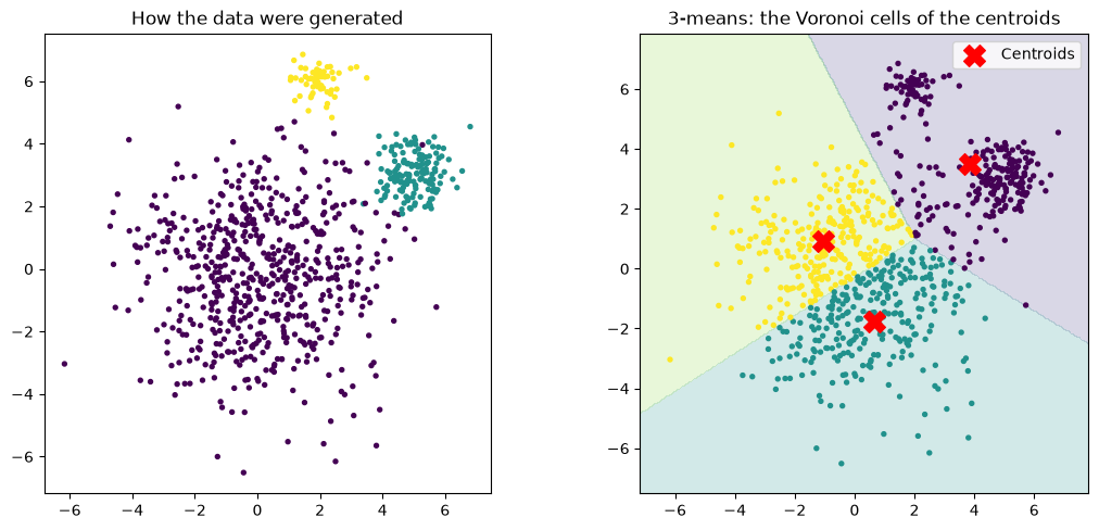
The boundaries are straight lines, the cells convex – and k-means invests two of its three centroids in the large cluster and merges the two small ones into one. That is not a failure of the procedure; it is precisely the decomposition with the smallest inertia: halving 600 points saves more squared distance than separating 210. If your data look like this, you need a procedure that also models the shape and the size of the clusters: a Gaussian mixture model, with its own covariance matrix and its own weight for each component, would have no trouble here.
- Schubert, E. (2023). Stop using the elbow criterion for k-means and how to choose the number of clusters instead. ACM SIGKDD Explorations Newsletter, 25(1), 36–42. 10.1145/3606274.3606278