PCA
Principal component analysis (PCA) is an unsupervised method that applies a coordinate transformation to the data so that the new coordinate axes are ordered by how much variance the data show along them. A very common application is to project onto the first (few) coordinates after a PCA, reducing the number of dimensions without throwing away too much of the information in the data.
When somebody says “we do a PCA”, they usually mean steps 1–2, often also 1–3:
fit – compute from the data a linear, invertible coordinate transformation – more precisely, an orthonormal basis. The new coordinate axes are called principal components or principal axes, and they are ordered by how much variance the data show along them.
transform – apply the transformation to data. These may well be data other than the ones it was computed from; that is exactly why there are two steps.
dimensionality reduction – project the transformed data onto the first principal components, that is, onto a low-dimensional linear subspace.
In Scikit-Learn the first two steps are called exactly that (PCA().fit(x), pca.transform(x), and fit_transform for both at once), and step 3 lives in the parameter n_components: PCA(n_components=2) throws away all but the first two principal components when transforming. Leave n_components out and you get nothing but a rotation of the coordinate system – and lose nothing.
The two figures show exactly these two cases: in blue the original data in space, in grey their projections onto the coordinate planes, and as an overlay the difference in total variance before and after the projection onto the plane.
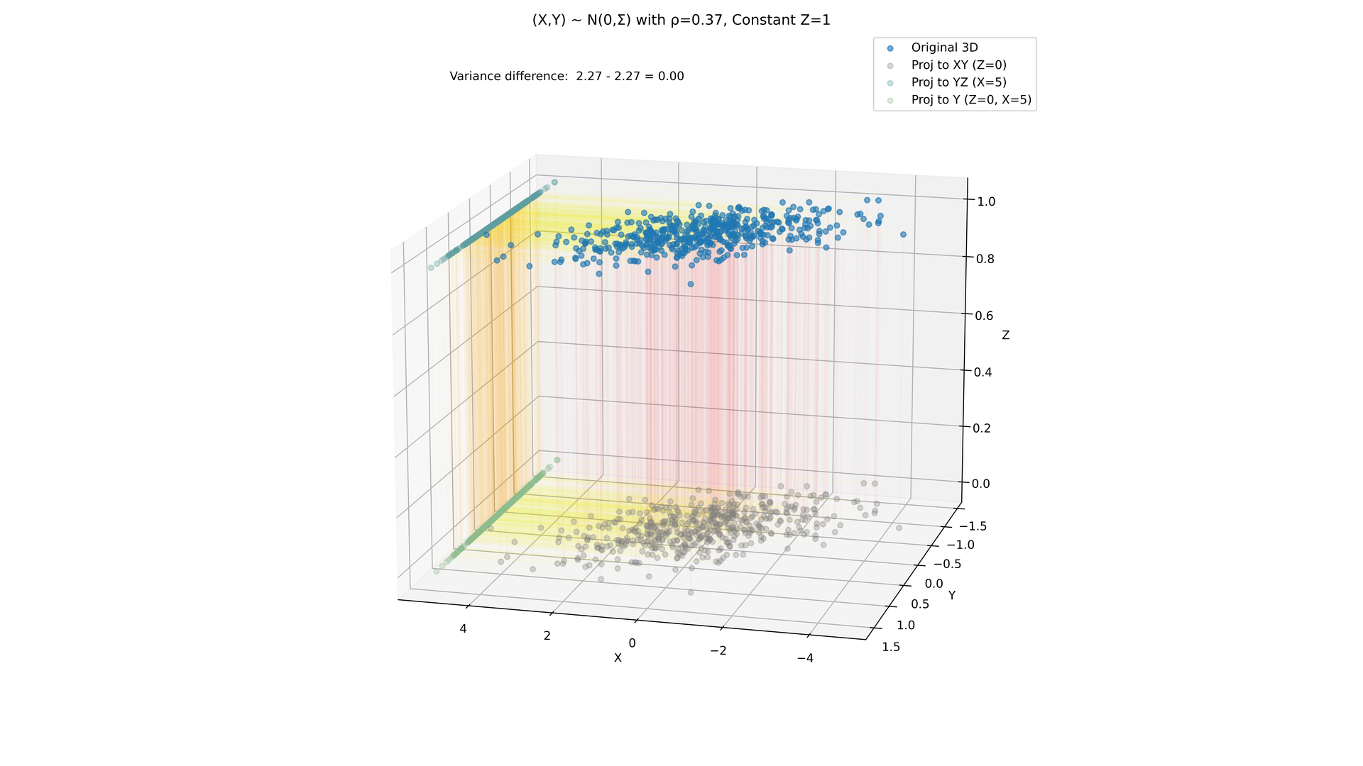
Figure 1:Case (a): is constantly 1. The projection onto the plane has exactly the same total variance as the original data – the third coordinate carries no information.
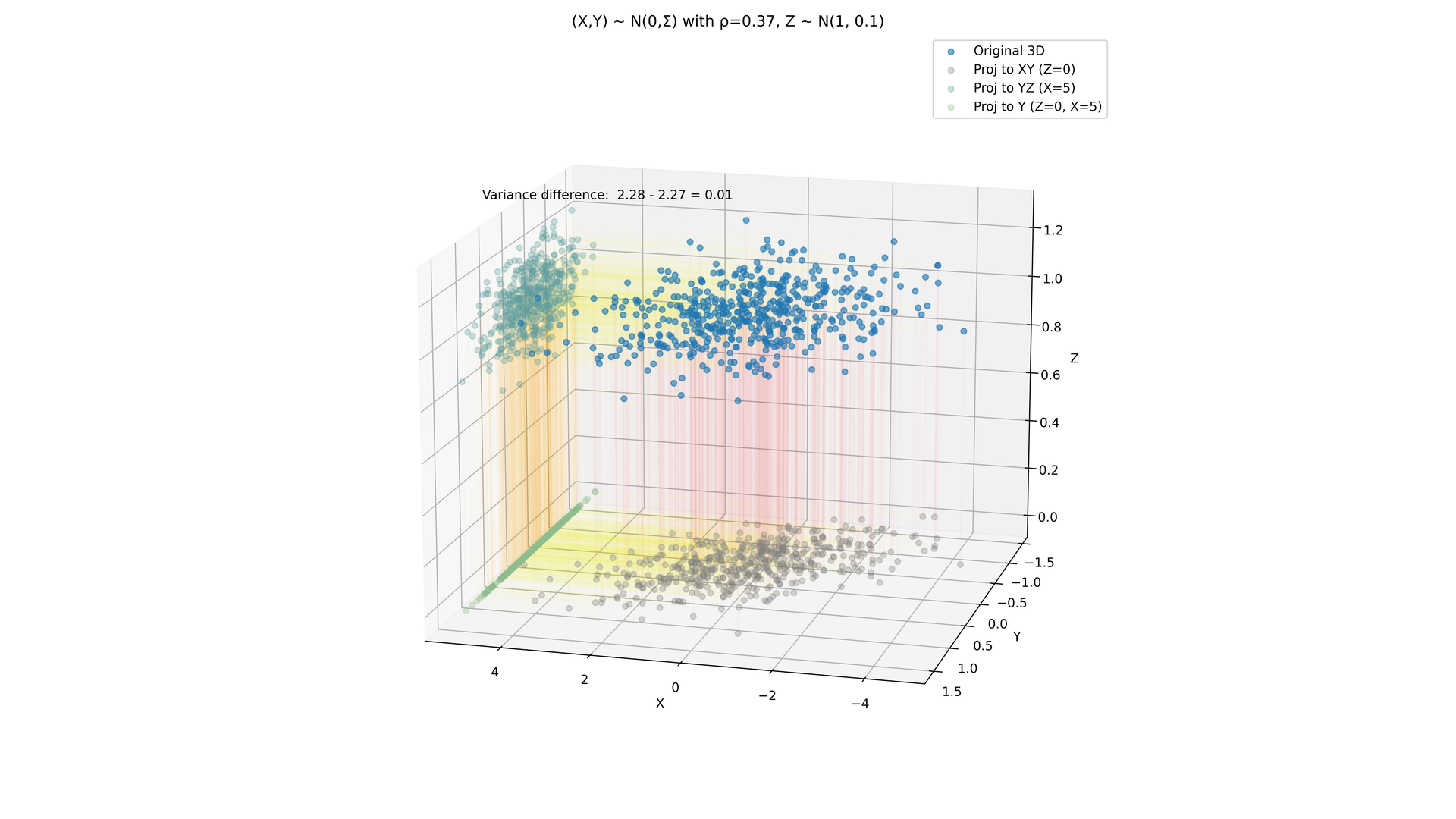
Figure 2:Case (b): . Now something is lost in the projection, but only 0.01 out of a total variance of 2.28 – less than half a per cent.
Case (b) is the realistic one: a coordinate is never exactly constant, it just varies very little. PCA makes this quantitative – it says not only that you may project, but also how much variance it costs (in Scikit-Learn, pca.explained_variance_ratio_).
A coordinate transformation is nothing but multiplication by an invertible square matrix. Such a matrix can compress or stretch in any direction, rotate about any axis by an angle, or shear. The goal of PCA is to find coordinates in which the first axis, the axis, carries the highest variance. Recall: if a matrix is read as a linear map by matrix multiplication, the images of the basis vectors are exactly the columns of the matrix. If we can find a vector pointing in the direction of greatest variance, we can write it into a matrix as the first column and project onto the subspace orthogonal to it (that is, we consider all vectors at a right angle to our first matrix column, which leaves a vector space one dimension smaller). Carrying on inductively, we obtain a matrix . The inverse map is then a transformation that maps the direction of greatest variance onto the first standard basis vector, that is, onto the axis.
Because we normalise every principal axis and always look for the next one in the orthogonal complement of the previous ones, the columns of are normalised and pairwise perpendicular: they form an orthonormal basis. Such a matrix is called orthogonal (also: orthonormal matrix). It satisfies (identity matrix), hence : the back-transformation is simply the transpose, and the inversion comes for free. Why the principal axes come out perpendicular to each other of their own accord is something we shall see at the end of the derivation below.
Unfortunately we have not yet said how to find the direction of greatest variance.
Derivation
These examples suggest asking which matrix could have produced the observed data from a standard normal distribution (or at least, for which matrix that would be most plausible). The eigenvectors belonging to the largest eigenvalue of are precisely the directions of greatest variance.
Such a covariance matrix can always be set up. If we do that with our real data and could then take a “square root” of it, we would have found the matrix . Fortunately, covariance matrices have a special property: they are positive definite and symmetric. (In the chapter The multivariate normal distribution we saw that the covariance matrix describes the ellipses of the density; the eigenvectors we are now computing are exactly the axes of those ellipses.)
There is a very simple way to find this matrix if is a diagonal matrix with nothing but positive entries: then is the diagonal matrix of the respective square roots. If is not a diagonal matrix, there are procedures for changing coordinates so as to turn into one. Mathematically this means that can be replaced by a transformation backwards, then a diagonal matrix , then the transformation forwards. In formulas: .
Suppose we have found such a decomposition (also called an eigenspace decomposition). Then we can compute as a square root of , and satisfies
The matrix we are after satisfies , or, rearranged, . For every column of and the -th diagonal entry of this gives an equation : the columns of are exactly the eigenvectors of , and the diagonal entries of are exactly the eigenvalues of belonging to them.
That eigenvectors belonging to different eigenvalues are perpendicular can be checked in one line: if and with , then, because ,
hence and therefore . If the eigenvectors are normalised as well, then is the matrix of all inner products , that is, the identity matrix. This is why the “rotation” of PCA (the matrix from the section on coordinate transformations above) is inverted by mere transposition, – which the code below exploits too.
So we have all the ingredients, provided only that we can somehow find the eigenvectors of the covariance matrix!
A good procedure for finding the eigenvector belonging to the largest eigenvalue: start with a random vector and apply the matrix to it. If it is an eigenvector – good, we note it down. If not, the matrix maps the vector into a direction that, with higher probability, points a little more towards the eigenvector belonging to the largest eigenvalue. So if we apply the matrix repeatedly, the chances are good that we get closer and closer to an eigenvector.
A less efficient procedure is the one you should have learned in linear algebra: first find the eigenvalues as the roots of the characteristic polynomial , then for every eigenvalue find the eigenspace by Gaussian elimination, that is, by solving the equation .
Numpy and Scikit-Learn fall back on LAPACK, which is written in Fortran and carries out a singular value decomposition (the decomposition ) in two steps. We shall not rack our brains over this any further; it belongs in a linear algebra or numerical analysis course. We do, of course, still want the computer’s help:
import numpy as np
import scipy.stats as st
import matplotlib.pyplot as plt
from sklearn import datasets
C = np.array([[2.5, 0.5], [0.5, 1.75]]) # for example!
# C is symmetric, so we take eigh: real eigenvalues, guaranteed sorted in ascending order
# (np.linalg.eig guarantees no particular order of the eigenvalues).
eigenvalues, eigenvectors = np.linalg.eigh(C)
eigenvalues, eigenvectors = eigenvalues[::-1], eigenvectors[:, ::-1] # descending, as in the SVD
print(eigenvalues)
print(eigenvectors)
T, s, vh = np.linalg.svd(C) # SVD = Singular Value Decomposition; singular values descending
assert np.allclose(s, eigenvalues)
print("in this example the transformation T is:")
print(T)
# Since C is symmetric positive definite, T is orthogonal, so vh = T^{-1} = T^T
# (eigenvectors are unique only up to sign, which is why eigenvectors and T
# may differ in the signs of individual columns.)
assert np.allclose(vh, T.T)[2.75 1.5 ]
[[-0.89442719 0.4472136 ]
[-0.4472136 -0.89442719]]
in this example the transformation T is:
[[-0.89442719 -0.4472136 ]
[-0.4472136 0.89442719]]
The eigenvalues are the variances of the data along the corresponding eigenvectors, the principal components. Their share of the total variance – here and – is called the explained variance of the respective component. This is the quantity you later use to decide how many components to keep.
Dimensionality reduction in five steps
From a dataset , PCA makes a dataset in with :
Centring: subtract its mean from every feature, so that the dataset has its centre of mass at 0 (usually with scaling as well, see below).
Compute the covariance matrix of the centred data.
Eigendecomposition: determine the eigenvalues and the corresponding normalised eigenvectors of .
Selecting: keep the eigenvectors belonging to the largest eigenvalues – they explain the fraction of the total variance.
Projecting: map every centred data point to its new coordinates .
C = np.array([[5.0, 3.0], [3.0, 5.0]])
values, vectors = np.linalg.eigh(C)
values, vectors = values[::-1], vectors[:, ::-1]        # descending
print("eigenvalues:", values, " explained variance of the 1st PC:", values[0] / values.sum())

x = np.array([2.0, 2.0])
new_coordinates = vectors.T @ x                         # step 5: inner products with v_1, v_2
print("new coordinates:", new_coordinates)
assert np.isclose(abs(new_coordinates[0]), 2 * np.sqrt(2)) and np.isclose(new_coordinates[1], 0)
eigenvalues: [8. 2.]  explained variance of the 1st PC: 0.8
new coordinates: [2.82842712 0.        ]
Now, instead of the made-up covariance matrix , we look at a real sample , distort it with a coordinate transformation, and then ‘undo’ that transformation with the method just discussed:
fig, axs = plt.subplots(1, 3, figsize=(9, 3))


x = st.multivariate_normal(mean=[0,0], cov=np.eye(2)).rvs(100000)
C = np.cov(x, rowvar=False)
assert np.all(np.isclose(np.eye(2), C, atol=0.1))
axs[0].scatter(x[:,0], x[:,1], alpha=0.1)
axs[0].set_title("Standard normal distribution")

# an arbitrary transformation:
Q = np.array([[6.75, 0.25], [1.75, 1.75]])
new_x = np.matmul(Q, x.T).T
axs[1].scatter(new_x[:,0], new_x[:,1], alpha=0.1)
axs[1].set_title("Transformed sample")
new_C = np.cov(new_x, rowvar=False)
print(new_C)

T, s, Tinv = np.linalg.svd(new_C)
newer_x = np.matmul(Tinv, new_x.T).T
axs[2].scatter(newer_x[:,0], newer_x[:,1], alpha=0.1)
axs[2].set_title("Back-transformed")

plt.show()
[[45.35696351 12.19917054]
[12.19917054 6.1101751 ]]
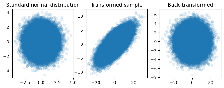
Look at the plots very closely. Have we undone the transformation completely? And either way, how can you tell?
Computation
In just the same way we can, of course, proceed with data we did not transform ourselves – data that may never have been sampled from a standard normal distribution in the first place.
iris = datasets.load_iris()
x = iris.data
C = np.cov(x, rowvar=False)
print(C)
T, s, Tinv = np.linalg.svd(C)
pca_x = np.matmul(Tinv, x.T).T

fig, ax = plt.subplots()
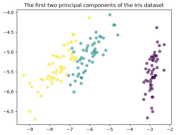
ax.scatter(pca_x[:,0], pca_x[:,1], c=iris.target, alpha=0.6)
ax.set_title("The first two principal components of the Iris dataset")
plt.show()

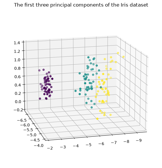
fig = plt.figure(figsize=(7,7))
ax = plt.axes(projection='3d')
ax.view_init(15, 75)
ax.scatter3D(pca_x[:,0], pca_x[:,1], pca_x[:,2], c=iris.target)
ax.set_title("The first three principal components of the Iris dataset")
plt.show()
[[ 0.68569351 -0.042434 1.27431544 0.51627069]
[-0.042434 0.18997942 -0.32965638 -0.12163937]
[ 1.27431544 -0.32965638 3.11627785 1.2956094 ]
[ 0.51627069 -0.12163937 1.2956094 0.58100626]]
Computation with Scikit-learn
We do not even have to compute the singular value decomposition or the eigenvectors of the covariance matrix ourselves – Scikit-learn can do that for us too:
from sklearn.decomposition import PCA

pca_iris = PCA().fit_transform(iris.data)

fig = plt.figure(figsize=(7,7))
ax = plt.axes(projection='3d')
ax.view_init(15, 75)
ax.scatter3D(pca_iris[:,0], pca_iris[:,1], pca_iris[:,2], c=iris.target)
ax.set_title("The first three principal components of the Iris dataset")
plt.show()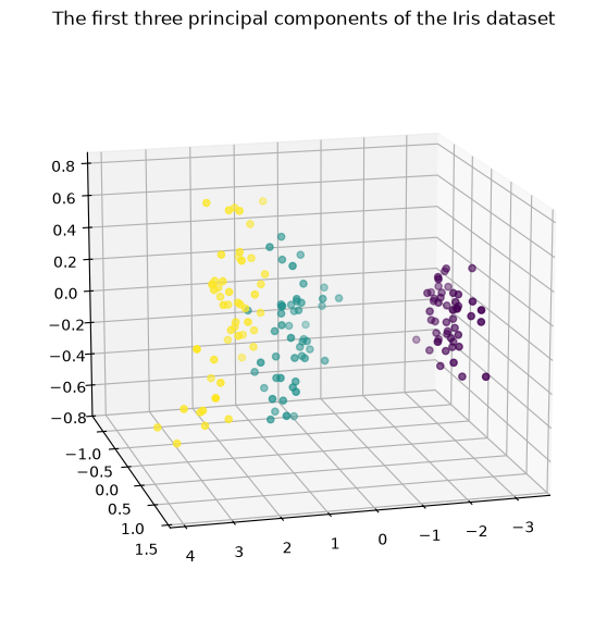
A completely different approach to finding the direction of maximal variance is to minimise the sum of the squared distances of the points from a straight line.
Up to the factor , the sum of the squared distances is a mean squared error. And for the we already know the best constant model: it is the mean (chapter Expected value and variance, section “Squared deviation”). In this sense the first principal component is the best linear model – the straight line through the mean that minimises the mean squared distance – and the animation shows that this is exactly the direction of greatest variance.
One easily missed detail distinguishes PCA from linear regression: here it is the perpendicular distance to the line that is minimised, whereas in regression it is the vertical distance, in the direction of the target variable. The two lines are therefore in general different.
Here is a picture of how this works:
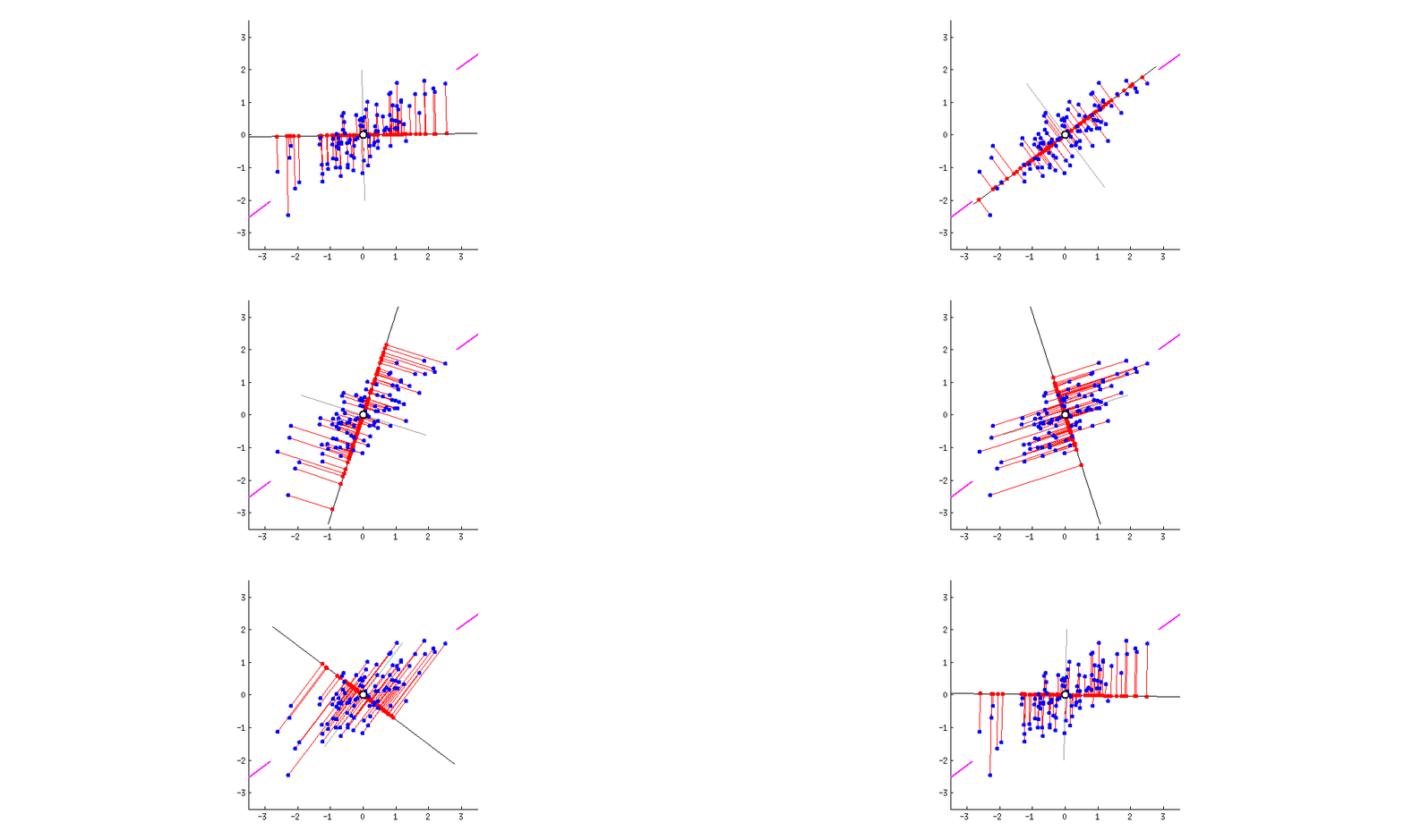
Figure 3:The line rotates until the sum of the squared distances is minimal – and that is the direction of greatest variance.
Application example: MNIST
So far we have reduced the dimension only for plotting – but many algorithms need the dimension kept at least small enough that the program does not run for weeks. A dataset with rather more than 4 variables is the MNIST dataset of handwritten digits.
digits = datasets.load_digits()
fig, axs = plt.subplots(1,10, figsize=(10,1))
for i in range(10):
    axs[i].axis("off")
    axs[i].matshow(digits.images[i],
                   cmap='gray_r')
plt.show()
x = digits.data
pca_x = PCA().fit_transform(x)

from sklearn.cluster import KMeans
kmeans_result = KMeans(n_clusters=10, n_init=1).fit(x)
kmeans_after_pca = KMeans(n_clusters=10, n_init=1).fit(pca_x)

from sklearn import metrics
print(metrics.normalized_mutual_info_score(digits.target, kmeans_result.labels_))
print(metrics.normalized_mutual_info_score(digits.target, kmeans_after_pca.labels_))
print(metrics.normalized_mutual_info_score(kmeans_result.labels_, kmeans_after_pca.labels_))
0.7250791394789893
0.7437984495348842
0.8572992273791208
How many components do you need? Scikit-learn gives the explained variance of every component directly (explained_variance_ratio_: the eigenvalues of the covariance matrix divided by their sum). The cumulative curve shows how much variance the first components explain together:
pca = PCA().fit(x)
ratio = pca.explained_variance_ratio_
cumulative = np.cumsum(ratio)

fig, ax = plt.subplots()
ax.plot(np.arange(1, len(ratio) + 1), cumulative, marker=".")
ax.axhline(0.9, linestyle="--", color="gray")
ax.set_xlabel("number of components")
ax.set_ylabel("explained variance (cumulative)")
plt.show()
print("components for 90% of the variance:", np.searchsorted(cumulative, 0.9) + 1, "out of", len(ratio))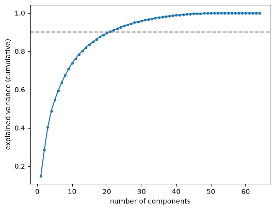
components for 90% of the variance: 21 out of 64
# Now we throw dimensions away
# and analyse how the classification suffers as a result:
scores = np.full(33, 0.0)
pca_x = PCA().fit_transform(x)

def update_scores(scores, pca_x, maxn, minn):
    for n in range(maxn, minn-1, -1):
        pca_x = pca_x[:,:n]
        kmeans_after_pca = KMeans(n_clusters=10, n_init=1).fit(pca_x)
        scores[n] = metrics.normalized_mutual_info_score(digits.target, kmeans_after_pca.labels_)
    return scores, pca_x
# Work in batches to avoid Jupyter cell timeout after 30 seconds:
scores, pca_x = update_scores(scores, pca_x, 32, 17)scores, pca_x = update_scores(scores, pca_x, 16, 1)fig, ax = plt.subplots()
ax.plot(np.arange(0, 33), scores)
ax.invert_xaxis()
plt.show()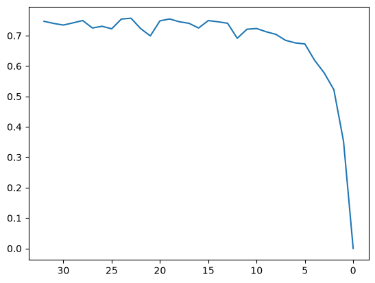
As the graph shows, the performance of 10-means as a classifier only suffers once we are down from the original 64 dimensions to no more than 10 and keep reducing.
In the Iris data we have already seen that the covariance matrices within the groups come out slightly different. Strictly speaking, for an optimal separation of the groups we do not want to favour the directions of greatest variance at all; we would much rather have the direction that separates best. To look at that, however, you have to know the classes already – which makes it supervised learning. One such method is linear discriminant analysis (LDA).
Differences in scale
Things become problematic when the data do not all lie on the same scale, as they did in the examples so far (metres in one place, centimetres in another), or when the scales are even unknown or incompatible (seconds, metres).
Then the variables with large numbers dominate, which is a distortion of the coordinate transformation we were actually after. To avoid this, you rescale every variable by its standard deviation, and likewise shift every variable so that its mean becomes 0. This is called ‘standardisation’. It is particularly sensible when the variable is approximately normally distributed.
A ‘normalisation’ is a rescaling onto the interval . It is particularly sensible when the variable is not normally distributed.
Any such rescaling is called ‘feature scaling’.
In Python, Scikit-Learn does this with a Scaler object:
import numpy as np
import matplotlib.pyplot as plt
from sklearn.preprocessing import StandardScaler

np.random.seed(1234)

# craft some dummy data:
dummycenters = [[10, 0.04, 3],
                [20, 0.03, 2],
                [30, 0.02, 1],
                [40, 0.01, 4]]
# make a random symmetric matrix with A@A.T for a random matrix A,
# make it positive definite by adding an identity matrix
dummycovs = (4*(A@A.T + np.eye(3))
             for A in (np.random.rand(3,3)
                       for _ in range(4)))
dummydata = np.concatenate([np.random.multivariate_normal(center,
                                                          cov,
                                                          size=200)
             for center, cov in zip(dummycenters, dummycovs)])
dummymu = np.mean(dummydata, axis=0)
# scale it:
scaler = StandardScaler()
scaled = scaler.fit_transform(dummydata)
scaledmu = np.mean(scaled, axis=0)
# let's take a look:
fig, axs = plt.subplots(2, 1, figsize=(8,8))
axs[0].scatter(dummydata[:,0], dummydata[:,1])
axs[0].plot(dummymu[0], dummymu[1], "+",
label="mean")
axs[1].scatter(scaled[:,0], scaled[:,1])
axs[1].plot(scaledmu[0], scaledmu[1], "+")
axs[1].set_title("Bottom: standard-scaled")
fig.legend()
fig.suptitle("Top: original data")
plt.show()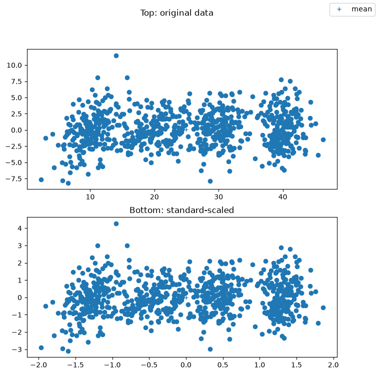
We now look at how scaling affects PCA and the k-means clustering that follows it, because instead of simply putting everything through the StandardScaler every time, you should always look at what difference it makes:
from sklearn.decomposition import PCA
from sklearn.cluster import KMeans

dummy_pca = PCA().fit_transform(dummydata)
scaled_pca = PCA().fit_transform(scaled)

dummy_kmeans = KMeans(4, n_init=1).fit(dummy_pca)
scaled_kmeans = KMeans(4, n_init=1).fit(scaled_pca)

# to compare:
original_labels = np.concatenate([np.full(200, k) for k in range(4)])
# let's take a look:
fig, axs = plt.subplots(2, 2, figsize=(10,10))
axs[0][0].scatter(dummy_pca[:,0], dummy_pca[:,1],
c=dummy_kmeans.labels_)
axs[1][0].scatter(scaled_pca[:,0], scaled_pca[:,1],
c=scaled_kmeans.labels_)
axs[0][1].scatter(dummy_pca[:,0], dummy_pca[:,1],
c=original_labels)
axs[1][1].scatter(scaled_pca[:,0], scaled_pca[:,1],
c=original_labels)
axs[1][0].set_title("Left: labels from k-means")
axs[1][1].set_title("Right: original classes")
fig.suptitle("Top: PCA unscaled,\n Bottom: PCA standard-scaled")
plt.show()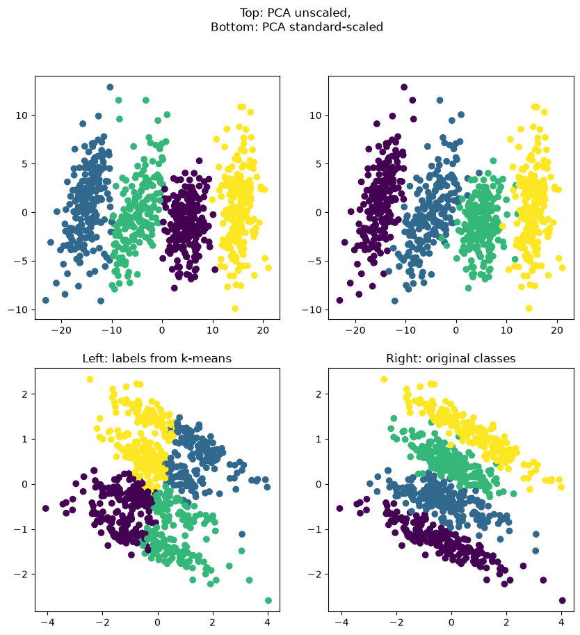
The top row clearly shows that k-means works well on the unscaled data. The bottom row shows that with standard scaling the principal components lie differently (which is why the picture looks rotated), but also that k-means has not divided the clusters up well.
This is ultimately an incarnation of Simpson’s paradox: the “right” way to scale the data here would make the clusters as close to standard normally distributed as possible. To achieve that, however, you would first have to cluster, then compute the standard scaling of the clusters, and then scale all the data together by a suitable mean of those. Clustering after that yields a different picture again – and the procedure can be iterated. In this setting it pays not to use k-means at all, but to go straight to a method that does not assume standard normally distributed clusters (Gaussian mixture models, for example).
Application example: Wine
Finally we look at a ‘success story’ for standard scaling:
import pandas as pd
from sklearn.datasets import load_wine

df, target = load_wine(return_X_y=True, as_frame=True)
assert type(df) == pd.DataFrame
assert type(target) == pd.Series
unscaled_pca = PCA(n_components=2).fit_transform(df)
unscaled_kmeans = KMeans(3, n_init=1).fit(unscaled_pca)
scaled = StandardScaler().fit_transform(df)
scaled_pca = PCA(n_components=2).fit_transform(scaled)
scaled_kmeans = KMeans(3, n_init=1).fit(scaled_pca)
fig, axs = plt.subplots(2, 2, figsize=(10,10))
axs[0][0].scatter(unscaled_pca[:,0], unscaled_pca[:,1], c=unscaled_kmeans.labels_)
axs[1][0].scatter(scaled_pca[:,0], scaled_pca[:,1], c=scaled_kmeans.labels_)
axs[0][1].scatter(unscaled_pca[:,0], unscaled_pca[:,1], c=target)
axs[1][1].scatter(scaled_pca[:,0], scaled_pca[:,1], c=target)
axs[1][0].set_title("Left: labels from k-means")
axs[1][1].set_title("Right: original classes")
fig.suptitle("Top: PCA unscaled,\n Bottom: PCA standard-scaled")
plt.show()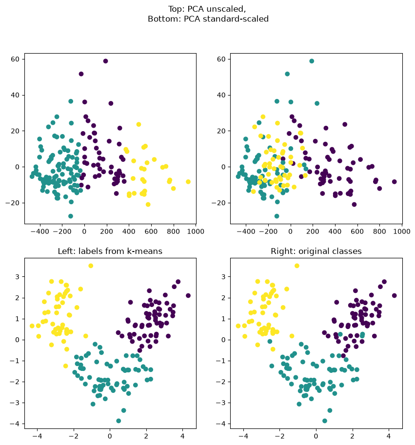
Rather than going by the picture alone, it is better to compute a summary measure as well. As before, we use an entropy-based measure: the mutual information of the two class variables (chapter Relative entropy), normalised by the mean of their two entropies:
from sklearn.metrics import normalized_mutual_info_score

scaled_score = normalized_mutual_info_score(scaled_kmeans.labels_, target)
unscaled_score = normalized_mutual_info_score(unscaled_kmeans.labels_, target)

print("The scaled version, with a similarity of %f to the 'true' class, is better than the unscaled version with a similarity of only %f" % (scaled_score, unscaled_score))
The scaled version, with a similarity of 0.865642 to the 'true' class, is better than the unscaled version with a similarity of only 0.423309