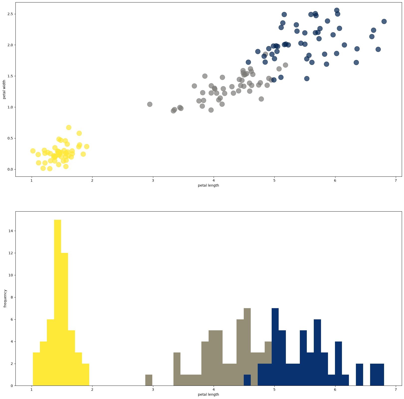
We will come back to the Iris dataset many times. For now we look at a plotting technique called “jittering”, which makes it possible to show data in a scatter plot even when many points take the same value. It is an alternative to histogram techniques and to adjusting the transparency (the alpha value).
import numpy as np
import matplotlib.pyplot as plt
from sklearn import datasets

iris = datasets.load_iris()
x = iris.data
classes = iris.target

print(x[:5])
print(classes[:5])
[[5.1 3.5 1.4 0.2]
[4.9 3. 1.4 0.2]
[4.7 3.2 1.3 0.2]
[4.6 3.1 1.5 0.2]
[5. 3.6 1.4 0.2]]
[0 0 0 0 0]
def jitter(xs):
    """Add a little noise to the values so that equal ones do not cover each other up in the scatter plot"""
    b = np.diff(np.sort(xs))
    distance = b[b>0].min()
    return xs + distance * (2*np.random.random(len(xs)) - 1)

fig, (ax1,ax2) = plt.subplots(2, figsize=(20,20))

petlen, petwid = jitter(x[:, 2]), jitter(x[:, 3]) # jitter!
#petlen, petwid = x[:, 2], x[:, 3] # no jitter here, it looks like a grid <---- try the difference!
plmin, plmax = np.min(petlen), np.max(petlen)
cmap = plt.cm.cividis_r

ax1.scatter(petlen, petwid, c=classes, cmap=cmap, alpha=0.7, s=200)
for c in np.unique(classes):
    # spread classes 0, 1, 2 over the colormap; -0.1 keeps class 0 off the very light end
    ax2.hist(petlen[classes == c], range=(plmin,plmax), bins=50, color=cmap(c/2-0.1))

ax2.set_xlabel("petal length")
ax2.set_ylabel("frequency")
ax1.set_xlabel("petal length")
ax1.set_ylabel("petal width")

plt.show()