Schutt & O'Neil (2013), p. 41 shows schematically how we go about ‘data science’:
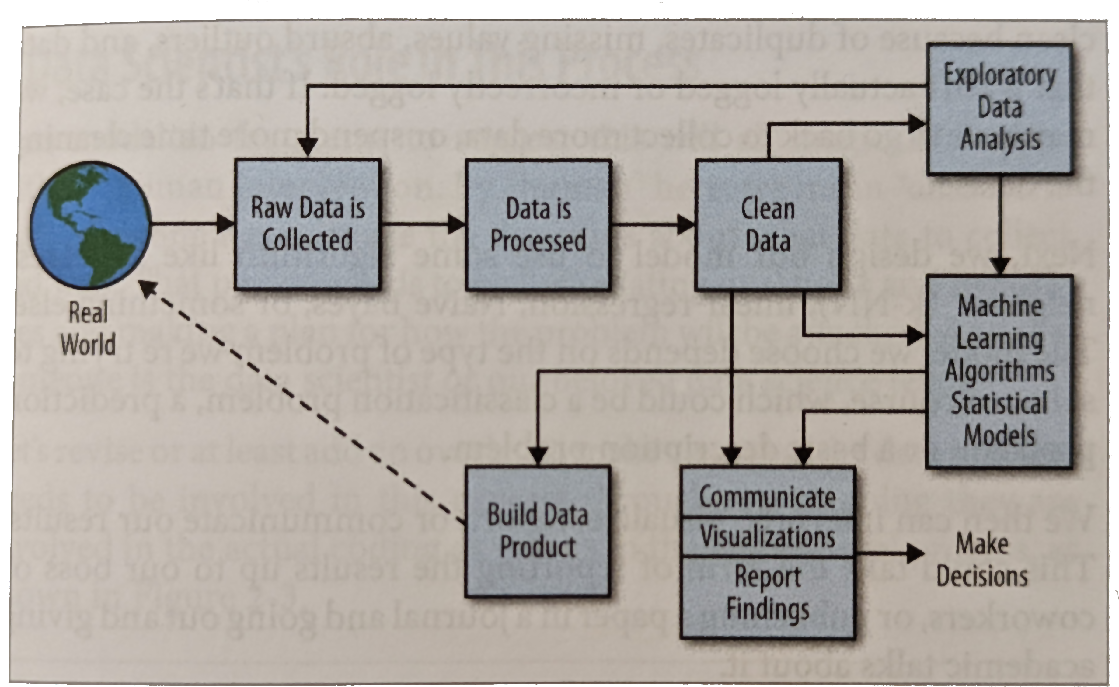
Figure 1:The “data science process”. Figure after Schutt & O'Neil (2013), p. 41 (Cathy O’Neil and Rachel Schutt, O’Reilly 2013).
Our focus here: exploratory data analysis
We will go over what we have learned about descriptive statistics so far and put it in a new context – summary statistics and visualisation in particular.
This revision doubles as a vocabulary lesson: we want to understand the language of statistical data analysis and the language of machine learning alike, and to be able to translate between them.
Statistics vs. machine learning
There are two “cultures”: statistics with statistical learning, and machine learning with predictive modelling. Machine learning is a subfield of artificial intelligence, statistics a subfield of mathematics.
Corresponding terms, statistics – machine learning
model – model (or, where neural networks are involved, the net)
parameters – weights
fitting – learning
performance on the test set – generalisation
regression, classification – supervised learning
density estimation, clustering – unsupervised learning
error function (loss function) – loss
estimating the parameters – training
sample – training data (training set); one pass through all the training data is called an epoch
The right-hand column is the vocabulary of the course “Introduction to Deep Learning”, which uses it throughout; anyone who knows the left-hand column will quickly find their way around there.
Exploratory data analysis means computing summary statistics and visualisations (descriptive statistics, that is) in order to get a better sense of the information in a dataset. It is a human-driven, iterative process, and it needs knowledge of the field of application – without some idea of which values are plausible and which questions are worth asking, you produce diagrams instead of insights. Data mining is about automating this step of a data science project: the automatic discovery of patterns and relationships, often following a scheme fixed in advance.
The cultures of modelling can be divided more finely still, as C. Molnar does in the book “Modeling Mindsets: The Many Cultures Of Learning From Data” Molnar (2022); to follow that, though, it helps to already know the maximum likelihood approach and Bayes’ theorem.
Descriptive statistics
Descriptive statistics covers the data analysis that happens before inferential statistics. Mostly that means describing the data through various summary measures.
A sample has a size = length = number of elements / rows / instances / outcomes (in Numpy that is the length of axis 0, see Numpy)
Distinct from the sample is the population: the totality of all possible outcomes, with some distribution.
With tabular data, the columns are also called variables, attributes, characteristics or features, and the possible values are called levels. A dataset with rows and columns therefore has samples and features. Not every column is a feature in the statistical sense, though: a serial number, a student number or a primary key from a database only identifies the row and carries no information about what was measured – any analysis that treats an ID as a feature will find, at best, chance in it and, at worst, the order in which the data was collected. The target variable you want to predict is a column too, but it does not count when you count the features. Depending on the kind of feature, several levels of measurement (also called scale types) are distinguished; a feature is said to be measured on a nominal, an ordinal or a cardinal scale:
Nominal scale: categorical, discrete, no fixed order (e.g. sex, postcode, religious affiliation). Careful: mean and median make no sense here, but frequencies do. The postcode is the classic case of “looks like a number, but is nominal” – a
mean()over a column of postcodes gives you a number that means nothing.Ordinal scale: values can be ordered, but with no measure of distance (e.g. rankings in sport, military ranks, the Mohs hardness of minerals). Careful: here too a mean makes no sense – Mohs hardness 5 does not lie “halfway” between 4 and 6; it is merely harder than 4 and softer than 6.
Interval scale (a cardinal scale): values (discrete or continuous) can be ordered and the distances between them stated, but the zero point is arbitrary (e.g. temperature in degrees Celsius, dates, the water level of the Rhine, Likert scales such as “does not apply at all … applies fully”). Differences are meaningful, ratios are not: 20\,^\circ\text{C} is not “twice as warm” as 10\,^\circ\text{C}.
Ratio scale: a cardinal scale with a natural zero point, so that the ratio of two values is a meaningful quantity (e.g. age, income, temperature in kelvin, speed in km/h, the number of people in a household). Here, for three values , the ratios and can be compared with each other.
Which summary measures, and which arithmetic, make sense for a feature depends on its level of measurement – see the summary below, in the section Level of measurement and permissible summary measures.
Univariate descriptions
are summary measures that refer to a single variable and not to how the variables relate to one another. They can be divided further:
central tendency (what used to be called ‘averages’)
The arithmetic mean (our estimate of the expected value of the underlying distribution)
The median (half the data points lie above the median, and in that sense it is the middle) Incidentally, it is always the case that On an ordinal scale (that is, when distances between the values cannot be stated) the median is a meaningful quantity
The mid-range is the arithmetic mean of the maximum and the minimum.
The geometric mean
is , the -th root of the product of the values (in Numpy
np.exp(np.mean(np.log(x))), or directly asscipy.stats.gmeanin Scipy). It is the right mean when values compound multiplicatively – for growth rates, say, the geometric mean of the yearly factors is the constant factor that would lead to the same result after years. It presupposes a ratio scale, because it needs a natural zero point: the geometric mean of 10\,^\circ\text{C} and 20\,^\circ\text{C} is \sqrt{200} \approx 14.14\,^\circ\text{C}, but convert the same two temperatures to kelvin and you get \sqrt{283.15 \cdot 293.15} \approx 288.11\,\text{K} \approx 14.96\,^\circ\text{C} – two different answers to the same question. For negative values it is not defined at all.The mode
is defined as the most frequent value. The term on its own is not very useful, but it is often used in the sense that a distribution is unimodal or bimodal. Unimodal means that there is one clearly recognisable mode which describes the distribution well. Bimodal means that the distribution is a mixture distribution whose two components have different modes, which you then see as two peaks. In general it is not clear-cut whether a dataset should be regarded as unimodal, bimodal or multimodal.
For variables on a nominal scale the mode is a meaningful measure of location
Several of the measures of central tendency come, in a sense, with a measure of dispersion of their own (see Dispersion), a fact you can remember as “dispersion precedes location”. The Wikipedia article ‘Central tendency’ is recommended on this.
Dispersion, spread
Measures of spread characterise how far the data scatters around a measure of location – that is, how strongly it deviates from it. Since this amounts to characterising how far the individual data points deviate from one another, measures of spread can also be defined without direct reference to a measure of location.
Range: the largest value minus the smallest
Variation ratio (also the non-modal proportion): the fraction of the sample whose value is not the mode
Quartiles: by analogy with the median, the lower quartile is the value below which exactly a quarter of the data lies, and the upper quartile the value above which exactly a quarter lies. The median is . Percentiles are defined in the same way. The difference is the interquartile range (IQR); it is the measure of spread that belongs to the median, and unlike the range it is insensitive to outliers – which is exactly why a boxplot draws its box from to .
Sample variance: mean squared error about the mean
Sample standard deviation
Once we calculate with units, a problem with the variance shows up: if a random variable or a vector (a column of a table, say) is measured in metres (a ratio scale), then computing the variance means summing, or integrating, over squares, so the variance is in square metres. This also shows that the variance is scale-dependent in general: comparing two variables, one in metres and the other in centimetres, by their variances is no comparison at all. Taking the square root fixes the first problem and yields, in the standard deviation, a measure in the same unit as the expected value.
Careful: two formulas go by the name “sample standard deviation”, one with in the denominator and one with . This is also known as the Bessel correction, and we will come back to it as part of estimation theory. In these notes the -version is meant unless stated otherwise (which is also how
numpy.stdcalculates); pandas (DataFrame.std) andscipy.stats, by contrast, divide by by default (ddof=1).Coefficient of variation
The standard deviation has the same unit as the data, but that still does not help when comparing two different features: is a spread of 3 hours a lot? The coefficient of variation is unitless and answers the question as a fraction of the mean (in Numpy
np.std(x)/np.mean(x), in Scipyscipy.stats.variation). It only makes sense on a ratio scale, because it depends on the zero point: computed in Celsius it can come out negative or infinite, in kelvin it cannot. Its reciprocal is the signal-to-noise ratio, used in exactly the same way in engineering – the larger it is, the more clearly the signal stands out from the noise.dispersion precedes location: every measure of spread has a measure of location that belongs to it, namely the value that minimises that measure of spread – which one depends on the norm you use to measure the error:
The mode minimises the variation ratio ()
The median minimises the mean absolute error ()
The mean minimises the mean squared error ()
The mid-range minimises the maximum absolute deviation ()
The two middle statements are proved in the chapter Expected value and variance, section “Quantifying deviation”.
Shape
Skewness is the third central moment, normalised by the standard deviation ()
Kurtosis is the fourth central moment, normalised by the standard deviation ()
Excess kurtosis is the difference between the kurtosis and the kurtosis of a normal distribution – which is exactly 3, whatever the parameters
Multivariate descriptions:
Correlations
We will have to deal with covariance and correlation soon. Covariance is to variance as an inner product is to a norm. The (Pearson) correlation coefficient is normalised so as to be scale-invariant.
Level of measurement and permissible summary measures
Not every summary measure above makes sense for every feature. A mean over postcodes is a number, but it is not information; a standard deviation over school grades presupposes that the distance from “good” to “very good” is the same as the distance from “sufficient” to “deficient”. The level of measurement decides what is allowed:
| Level of measurement | Example | Meaningful comparisons | Measure of location | Measure of spread |
|---|---|---|---|---|
| nominal | degree programme, colour, postcode | equal / not equal | mode | variation ratio (non-modal proportion) |
| ordinal | school grade, Mohs hardness, rank | additionally: smaller / larger | median, quartiles | range, interquartile range |
| interval | temperature in °C, date, Likert scale | additionally: differences | arithmetic mean, mid-range | variance, standard deviation |
| ratio | age, price, temperature in K | additionally: quotients | additionally: geometric mean | additionally: coefficient of variation |
Every level of measurement also permits all the summary measures of the rows above it: for a cardinal feature you may report the median and the mode as well, for an ordinal one the mode. The other way round does not work – the mean and variance of a nominal variable are meaningless, even when its levels are stored as numbers. So a column of data type int is a long way from being on a cardinal scale: an ID is nominal, a school grade ordinal.
Two nominal features. There is no correlation coefficient for the relationship between two nominal features, but there is an equally simple summary measure: the cross-tabulation (contingency table), which counts how often each combination of levels occurs. A cross-tabulation of ground truth against prediction is called a confusion matrix; the chapter Titanic EDA reads the quality of a classifier off one, and pandas produces it with pd.crosstab.
Encoding categorical features. Most machine learning methods (linear regression, say) calculate with numbers, and how to translate a nominal or an ordinal feature into numbers depends on the same table:
An ordinal feature may be encoded as integers along its order (“low” , “medium” , “high” ; integer or ordinal encoding). The order is real; only the equal spacing is a modelling assumption, and one to keep an eye on.
A nominal feature may not be: encode degree programmes as and you invent an order and distances that do not exist, and a linear model would calculate with them. Instead you give every level a column of its own, which is 1 when that level is present and 0 otherwise (one-hot encoding; the columns are also called dummy variables). A single column “degree programme” with three levels thus becomes three columns of zeros and ones.
The chapter Linear regression shows how to do this with pandas, and what it means for a regression, on the Melbourne dataset. How to unify different spellings of a category beforehand is covered in the chapter Data cleaning.
A worked example
Take the values – the number of emails per day over a week plus a day, say.
Sorting: .
Mode: 4, the only value that occurs more than once.
Median: is even, so we take the mean of the two middle values 4 and 5: .
Quartiles: the lower half has median , the upper half has median ; the interquartile range is . Careful: there are several conventions for quartiles.
numpy.percentileinterpolates linearly between the sorted values by default and gives and here.Range: . Mid-range: .
Mean: .
Variance (-version): the deviations from the mean are ; their squares add up to 79.5, so .
Standard deviation: . With the Bessel correction: .
Coefficient of variation: – the spread amounts to a good half of the mean, so the days are very uneven. Geometric mean: , smaller than the arithmetic mean 5.75 (which is no accident: the geometric mean is never larger than the arithmetic one).
Check: . The mean lies above the median because the outlier 12 pulls it up: the distribution is skewed to the right.
The same in Numpy (with the quartiles as numpy.percentile interpolates them):
import numpy as np
x = np.array([7, 2, 9, 4, 4, 12, 5, 3])
print(np.median(x))            # 4.5
print(np.percentile(x, [25, 75]))  # [3.75 7.5 ]
print(np.mean(x), np.var(x))   # 5.75 9.9375
print(np.std(x))               # 3.1524... (n-version)
print(np.std(x, ddof=1))       # 3.3701... (Bessel correction, n-1)
print(np.std(x) / np.mean(x))  # 0.5482... coefficient of variation
print(np.exp(np.mean(np.log(x))))  # 4.9542... geometric mean
Simpson’s paradox
Before we come to the pictures, a warning about aggregation that needs nothing more than percentages and still shows why data analysis is more than arithmetic. It comes from a medical study of two treatments for kidney stones Charig et al. (1986); we will simply call them A and B. Each was given to 350 patients, and “success” is whatever the clinicians defined it to be.
| Treatment | Patients | Successes | Success rate |
|---|---|---|---|
| A | 350 | 273 | 78% |
| B | 350 | 289 | 83% |
Imagine you have kidney stones. Which treatment do you choose? Most people say B.
But there is no such thing as simply “kidney stones”: there are small ones and large ones. Let us split the table along that line:
| Treatment | small stones | large stones |
|---|---|---|
| A | 81 of 87, so 93% | 192 of 263, so 73% |
| B | 234 of 270, so 87% | 55 of 80, so 69% |
For small stones A is better, for large stones A is better. If you have small stones you want A; if you have large stones you want A. And only if you do not know how large your stones are would you want B? That cannot be right, because your stones are either small or large.
The resolution lies in the absolute numbers, not the percentages. Treatment A was used almost exclusively on large stones (263 of 350), treatment B almost exclusively on small ones (270 of 350). Large stones are harder to treat, so the large group of difficult cases drags A’s overall rate down, while B profits from its large group of easy ones. The doctors chose the therapy by stone size, and stone size determines success. A variable like this, one that influences both which group you end up in and the outcome, is called a confounder. The punchline: you should choose B only if it also lets you choose to have small stones.
This phenomenon is called Simpson’s paradox: a relationship that holds overall can reverse in every single subgroup. It occurs not only in tables of percentages but just as readily with continuous features:
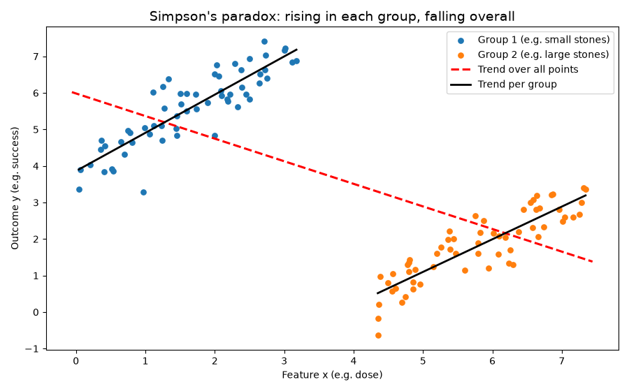
Figure 2:Simpson’s paradox with continuous features: within each group rises with , over all the points together the trend falls.
In the kidney stone example we knew the stone size. Often, though, the variable that creates the groups is not in the table at all: then all we see is the cloud of points on the right, without the colours, and the falling trend looks entirely convincing. Such an unobserved variable is called a latent variable – nothing mysterious about the word, it just means “not observed”. The overall distribution is then a mixture of two group distributions, and the question of whether a cloud of points can be decomposed into such groups will meet us throughout this book: with the contaminated normal distribution, with clustering by k-means, and finally with Gaussian mixture models. That covariance and correlation walk straight into this trap is something we will see in the chapter Covariance.
Solution
Across all the plants the relationship is weakly negative (correlation coefficient about -0.12): wider sepals go with shorter ones. Within each species it is clearly positive (setosa about 0.74, versicolor 0.53, virginica 0.46). The species is the confounder: setosa has short, wide sepals, the other two long, narrow ones. Anyone who does not know the species sees a trend that holds in no group at all. How the numbers are computed is shown in the remark For data in the chapter Covariance.
Visualisation
Why visualise? The first reason: summary numbers can lie without letting it show. Alberto Cairo invented the ‘Datasaurus’ to point out the difference between summary statistics and visualisation:
Never trust summary statistics alone; always visualize your data.
Alberto Cairo, 2016
Justin Matejka and George Fitzmaurice developed it into the ‘Datasaurus Dozen’ Matejka & Fitzmaurice (2017): twelve datasets that all share the same summary statistics (the same means and standard deviations of and to two decimal places, and the same correlation coefficient of about -0.06 as well; what that measures comes in the chapter Covariance and dependence) but look very different indeed.
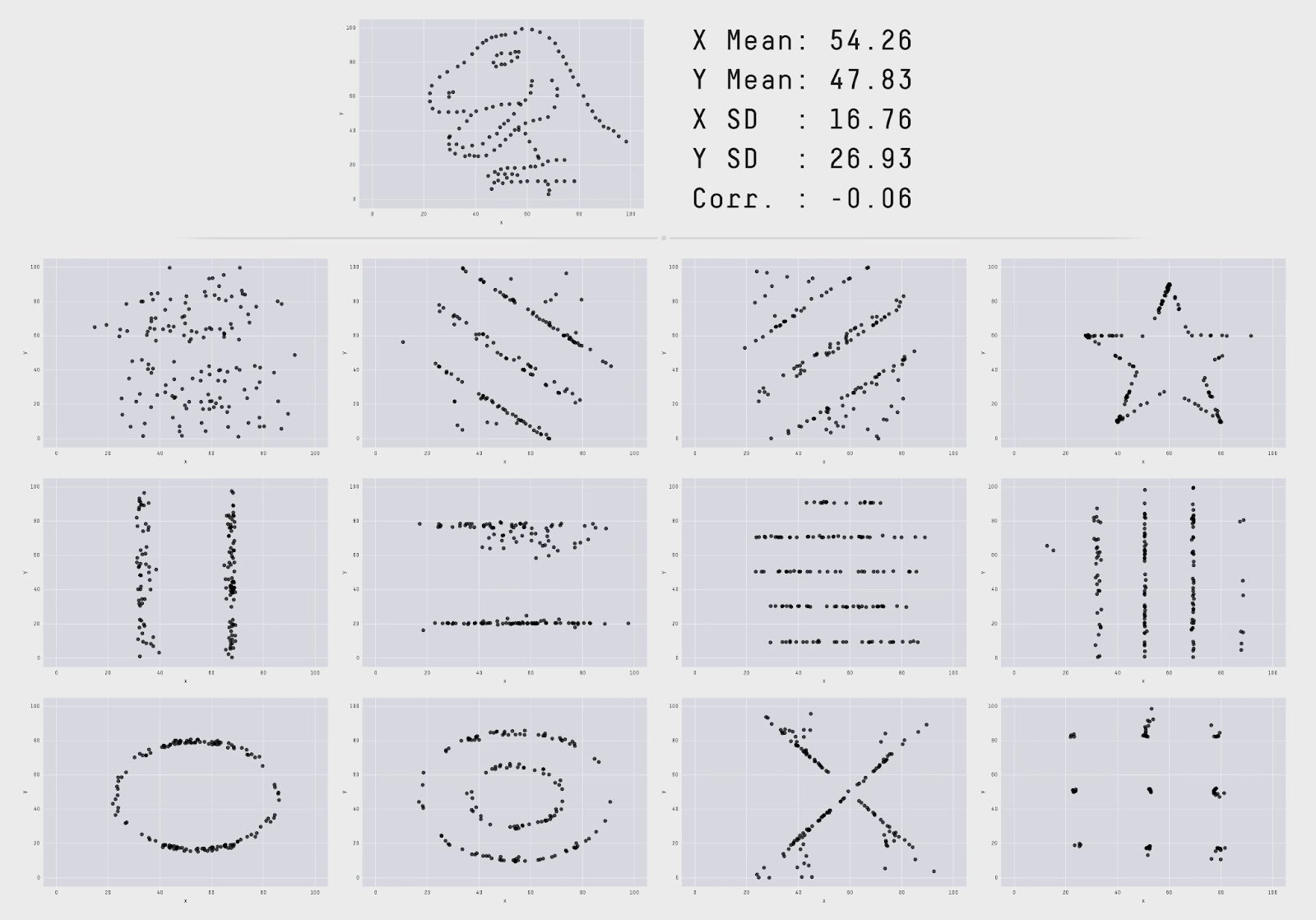
Figure 3:The Datasaurus Dozen, inspired by Anscombe’s quartet. Figure: Justin Matejka and George Fitzmaurice, Autodesk Research 2017 Matejka & Fitzmaurice (2017).
The second reason to always plot is Simpson’s paradox from above: a single summary measure over all the data can say the opposite of what holds in every group, and in a plot you can see the groups.
The most important kinds of plot
Histograms
To visualise the frequency distribution of a feature on a cardinal scale, you can put the feature on the x-axis and draw rectangles side by side, each with an area that represents the frequency of one class – the sum of the frequencies over the interval beneath it on the x-axis. The length of that interval is called the bucket size, bin size or class width. Choosing the right bin size is a science of its own, and there are various algorithms for computing a “good” one.
Histograms are thus a special kind of bar chart or column chart. For features on a nominal scale you can look at the corresponding bar chart directly: rectangles of equal width whose heights give the frequency of each level. For that, some arbitrary ordering of the levels has to be chosen as well.
The ordering is arbitrary only for nominal features, though; for an ordinal feature the -axis should follow the order, otherwise you throw away the information it carries. To show several groups in the same diagram, you stack the bars on top of one another (
plt.bar(..., bottom=...)) – a stacked bar chart. That makes sense precisely when the sum of the groups means something in itself; otherwise bars placed side by side are easier to compare, because they all stand on the same baseline. A simple example withplt.baris in the chapter Titanic EDA.So a histogram is really a statistical transformation of continuous data (on a cardinal scale) into discrete data, which is then drawn as a bar chart.
Recommended: the article “Histogram” on Wikipedia, without code, and the histogram examples in the Matplotlib documentation, with code
Scatter plot
A set of vectors in can be displayed by drawing a symbol – a filled circle, say – at each point’s coordinates. With tabular data, you typically pick out two variables, one for the x-axis and one for the y-axis.
In Matplotlib that is a single line, and if the data is already an array, the two variables are its two columns:
plt.scatter(x, y, marker="o")
plt.scatter(data[:, 0], data[:, 1])                  # the same for an (N,2) array
plt.scatter(data[:, 0], data[:, 1], c=data[:, 2])    # third column as colour
The third line is the trick by which a scatter plot takes on a third variable:
c=colours every point by its value, andcmap=decides which colour scale is used. For a categorical feature with few levels this gives groups in different colours – that is how the Iris scatter plot in the chapter Iris is coloured (there withcmap=plt.cm.cividis_r), and in the chapter Exploratory analysis: examples the colour carries the grape variety in the wine dataset.Boxplot, also box-and-whiskers plot
Shows the median, quartiles and outliers of a distribution in one picture: the box runs from to , the “whiskers” reach to the last value within 1.5 interquartile ranges, and everything beyond that is drawn as an individual point. In Matplotlib,
plt.boxplot(x); the chapter Data cleaning uses the same rule for outliers.Line plot
When you plot the graphs of one or more functions (as we did with the PDFs), those are line plots. Data on a cardinal scale can be displayed with a line plot just as well, but connecting the points suggests a wealth of data that is not necessarily there.
Conversely, the line plot is exactly the right tool when the data really does come from a curve: you sample points along the curve and connect them. A circle, for instance, is drawn like this:
angle = np.linspace(0, 2 * np.pi, 360)
plt.plot(np.cos(angle), np.sin(angle), linewidth=2)
plt.axis("equal")    # otherwise the circle turns into an ellipse
The same principle is behind every density plot in this book: the density function is evaluated at a few hundred points and the values are connected.
Pie chart
As a rule: wherever a pie chart will do, a bar chart will do too, and it is easier to read. Pie charts are therefore of value mainly when you want to lighten up a text without going into the statistic shown in any detail. Features on a nominal or an ordinal scale are in principle suited to them, since the pie shows the share of each level in the whole – it is a bar chart drawn in an unusual way.
Violin plot
Similar to a boxplot, but in place of the rectangle the density is drawn in outline. One disadvantage is that it is rarely used, so readers are not accustomed to this kind of plot.
Map plot
With the image of a map (or some other kind of map, a network topology, say) in the background, features can be displayed spatially – as the colour of a bounded area, for instance. This is akin to a histogram: instead of a scatter plot, two-dimensional regions (rather than intervals) are aggregated over before the aggregated data is displayed. A special case is a “map” that is simply a grid onto which frequencies are plotted – a two-dimensional histogram.
countless others, used more rarely or not fitting this scheme – which means of communication is most suitable always depends on the case at hand.
The most important tools for plotting with Python
matplotlib– this is what we use; it is the most widely used package for PythonThe object-oriented interface of
matplotlib– recommended by the developersSeaborn – a layer on top of
matplotlibthat makes far-reaching assumptions about what might look good, with a focus on ease of usePlotnine – an implementation of the grammar of graphics in Python, analogous to R’s
ggplot2Bokeh – interactive web plots, e.g. the demo on the IMDB dataset
Pygal – generates SVG files, which together with HTML5 can also be used for animations.
The grammar of graphics
History
1983: Bertin: Semiology of Graphics
2000: Wilkinson, Anand, Grossman: The Grammar of Graphics
2005: Wickham:
ggplot2R package2010: Wickham: A Layered Grammar of Graphics
Layers of the grammar
Data – what is to be visualised?
Aesthetics – axes, dimensions
Scales – should the values be scaled? Nominal or ordinal?
Geometry – points, lines, polygons
Statistics – means, for example
Facets – subplots
Coordinate systems – Cartesian, polar or logarithmic
Combining the parts:
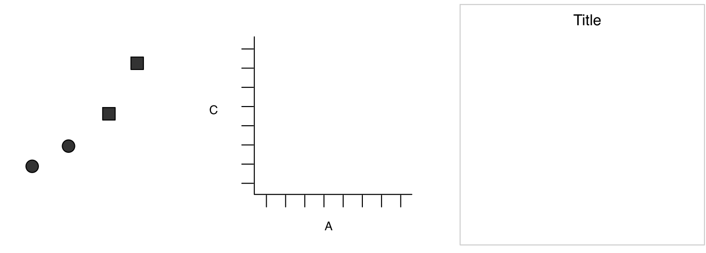
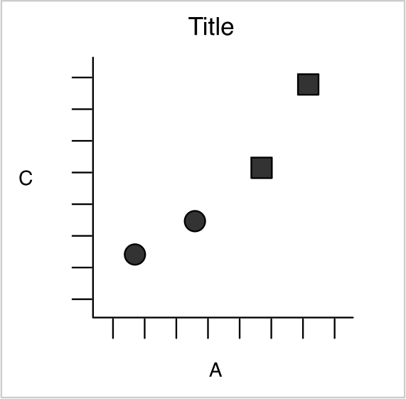
A layer consists of
Data and aesthetic mappings (aes)
Statistical transformations (stat)
Geometric objects (geom)
Position adjustments
A plot consists of
A default dataset and mappings of the variables in it to aesthetics
One or more layers (not necessarily with additional data)
One scale per aesthetic mapping
A coordinate system
A facet specification
A statistical transformation is typically a summary of data.
Example: smoothing, which turns a set of points into a curve that is smooth (infinitely differentiable).
We have already met some of the most important statistical transformations implemented in ggplot2:
bin: divide a continuous range into bins (classes) and count the points in each class.
boxplot: compute the statistics for a boxplot
contour: compute contour lines
density: compute a one-dimensional density estimate
identity: the identity map, f (x) = x
jitter: shift every value by a small random amount
smooth: smoothed mean of y given x
summary: summed values of y for each x
unique: remove duplicates
A scale, in the sense of the grammar of graphics, controls how data is mapped to aesthetic attributes.
Example: a real variable between 0 and 1 can be displayed as a change of colour from blue to red. The scale is the mapping of all the values in to colour values; its inverse can be used to draw a legend.
Example: a factor variable (the species in the Iris dataset, say) is displayed with different symbols (in a scatter plot, say). The mapping from level to symbol is the scale.
You can also map several variables onto one aesthetic – by mapping different values onto saturation and hue in the HSV colour model, for instance.
Colours
When choosing colour scales you have to think about distinguishability, but also about the people who will look at the plots later. Two reasons never to use colour as the only distinguishing feature:
First, the circumstances. A plot gets looked at in sunlight on a laptop, projected through a badly calibrated beamer, or printed out – in the past routinely in greyscale. What survives is the lightness. A colour scale should therefore still work once you take the colour away, and curves are additionally told apart by line style (
linestyle="--", dotted, different line widths) or by markers (marker="x", circles, triangles).Second, the viewers themselves. About one man in twelve and one woman in two hundred perceive colours differently from the majority, most often red and green. In a lecture with two hundred listeners there are therefore typically several people for whom a red-green scale is no scale at all. That is often enough to make it a habit rather than an exception.
A colour palette that works well even with restricted colour perception is this one:

That it works can be checked by calculation: a colour vision deficiency can be simulated as a linear map in colour space, and applied to the eight colours above, that looks like this.
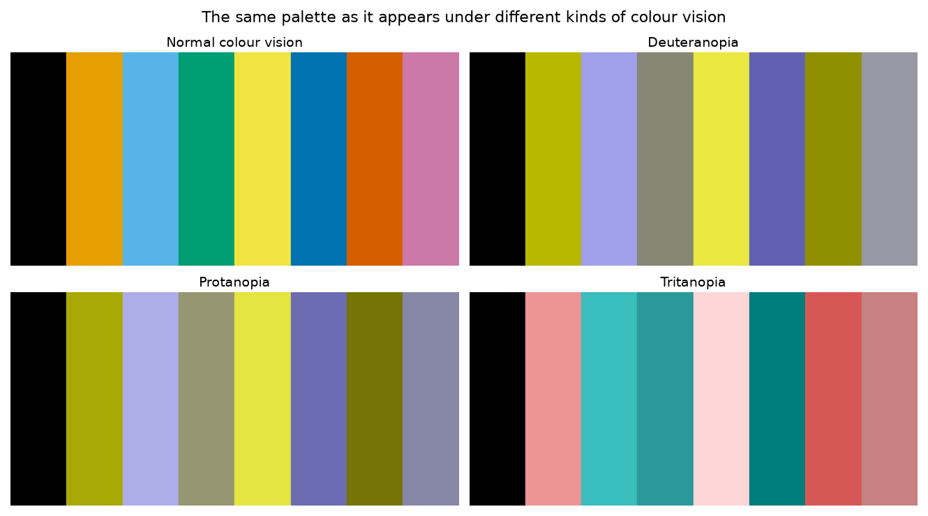
Figure 4:The same palette, simulated for normal colour vision and for the three kinds of dichromacy (method after Viénot, Brettel and Mollon 1999). The colours stay distinguishable in all four panels – that is the property that matters.
Two things can be seen from it. First, the palette does lose its colourfulness, but no two patches merge – every colour keeps a lightness of its own. Second, a palette that set red against green would merge here, and that is exactly what happens with the widespread traffic-light coding.
Research into suitable colour palettes is not finished – at the SciPy conference in 2022, for instance, there was the talk Development of Accessible, Aesthetically-Pleasing Color Sequences by Matthew Petroff, whose results went into Matplotlib version 3.10.0 in December 2024.
Exploratory data analysis as a process
The tools of this chapter – levels of measurement, measures of location and spread, visualisation – are means to an end. The end is called exploratory data analysis (EDA): opening up a dataset step by step until you can say something about it. “Step by step” is meant literally here, and above all: in a circle. You go through the following five steps not once but again and again, because every pass throws up new questions.
Formulate the research questions. What do you actually want to know? What levels of measurement do the features have, what distributions do you expect, which relationships do you consider plausible? Without this step you produce diagrams instead of insights. In the chapter Exploratory analysis: examples this step comes expressly first.
Visualise the data. The quickest way to see a distribution, an outlier or a relationship is a picture – that was the previous section, and the Datasaurus showed why summary numbers alone are not enough.
Clean the data. Check outliers and remove them where necessary, impute or interpolate missing values, repair errors in the coding. In the chapter Titanic EDA missing ages are replaced by the median; the chapter Data cleaning turns that into a programme of its own.
Transform the data. Select subsets, rescale features, build new features – age groups out of age (binning), say, or an area out of length and width. Such new columns are features too, and finding them is often where the real insight lies.
Model the data. Choose a statistical model and fit it to the data – a normal distribution or a regression line, for instance. The chapters that follow are about that.
The five steps are a finer resolution of the whole picture that Figure 1 showed at the start of the chapter. And because they run in a circle, it is also clear why EDA cannot be automated: step 1 needs somebody with a question, and step 3 somebody who knows which values are implausible in this field of application. We practise that in the chapters that follow, on several datasets.
- Schutt, R., & O’Neil, C. (2013). Doing Data Science: Straight Talk from the Frontline. O’Reilly Media, Inc.
- Molnar, C. (2022). Modeling Mindsets: The Many Cultures Of Learning From Data (p. 113). Independently published.
- Charig, C. R., Webb, D. R., Payne, S. R., & Wickham, J. E. A. (1986). Comparison of treatment of renal calculi by open surgery, percutaneous nephrolithotomy, and extracorporeal shockwave lithotripsy. British Medical Journal (Clinical Research Edition), 292(6524), 879–882. 10.1136/bmj.292.6524.879
- Matejka, J., & Fitzmaurice, G. (2017). Same Stats, Different Graphs: Generating Datasets with Varied Appearance and Identical Statistics through Simulated Annealing. Proceedings of the 2017 CHI Conference on Human Factors in Computing Systems, 1290–1294. 10.1145/3025453.3025912