We now work through the first steps of exploratory data analysis – as much of it as we have learned so far – on a few examples.
import numpy as np
from scipy import stats as st
import matplotlib.pyplot as pltWine
We begin with an old dataset, which can be downloaded from the UC Irvine Machine Learning Repository, among other places:
url = "https://archive.ics.uci.edu/ml/machine-learning-databases/wine/wine.data"According to the documentation the dataset has 178 rows (called instances here, as they often are) and 14 variables. The first variable is categorical, encoded as an int from {1, 2, 3}; the others are continuous real variables (hence float). The licence is CC-BY-4.0, so we may use the dataset freely, modify it and share our results, provided we name the original source:
Riccardo Leardi, riclea@anchem
.unige .it
The dataset comes as two files:
wine.datawine.names
Here wine.data is the dataset proper, without any metadata, and wine.names holds the metadata in human-readable form.
From wine.names we take the following in particular:
These data are the results of a chemical analysis of wines grown in the same region in Italy but derived from three different cultivars. The analysis determined the quantities of 13 constituents found in each of the three types of wines.
The attributes are
Alcohol
Malic acid
Ash
Alcalinity of ash
Magnesium
Total phenols
Flavanoids
Nonflavanoid phenols
Proanthocyanins
Color intensity
Hue
OD280/OD315 of diluted wines
Proline
Number of Instances
class 1 59
class 2 71
class 3 48
Now that we have successfully downloaded the data and read through the metadata that come with them, we can ask what we actually want to do with them.
One obvious task is to find out whether the three classes (that is, the three producers of the wine) can be told apart by the wine’s chemical composition. In statistical terms: do the distributions of the 13 variables differ enough from class to class for the individual data points (the instances) to be assigned to a class on that basis?
We can set this up as a game: if we delete the first variable, the class, can it be reconstructed from the rest? In the simple version we do not delete the class yet, but use it to estimate three different distributions for each of the 13 attributes. Then, for every instance and ignoring its class, we judge which distribution it most likely belongs to, and check whether we were right.
In the advanced version we split the data into training and test data, or form the three (or more) classes without using the variable “class” at all. First, though, let us take a look at the data.
Quite apart from the classes, one thing is interesting straight away: how are the data distributed? We ask that now for each variable on its own.
# Numpy's genfromtxt assumes whitespace-separated data,
#   so we state the delimiter explicitly:
data = np.genfromtxt(url, delimiter=",")
print(type(data), data.shape)
print(data[0]) # one instance
<class 'numpy.ndarray'> (178, 14)
[1.000e+00 1.423e+01 1.710e+00 2.430e+00 1.560e+01 1.270e+02 2.800e+00
3.060e+00 2.800e-01 2.290e+00 5.640e+00 1.040e+00 3.920e+00 1.065e+03]
wine_class = data[:,0].astype("i8")
# If wine_class were a Python list:
#class_counts = [wine_class.count(d) for d in (1,2,3)]
# In Numpy it goes like this:
unique, counts = np.unique(wine_class, return_counts=True)
print(dict(zip(unique, counts)))
# If counts were a Python list:
#assert counts == [59, 71, 48]
# In Numpy it goes like this:
print(np.equal(counts, [59, 71, 48]))
assert np.all(np.equal(counts, [59, 71, 48]))
{np.int64(1): np.int64(59), np.int64(2): np.int64(71), np.int64(3): np.int64(48)}
[ True True True]
alcohol = data[:,1]
print("min", np.min(alcohol),
      "max", np.max(alcohol),
      "range", np.max(alcohol) - np.min(alcohol),
      "std", np.std(alcohol),
      "n", len(alcohol))
plt.hist(alcohol, bins="auto")
plt.show()
min 11.03 max 14.83 range 3.8000000000000007 std 0.8095429145285168 n 178
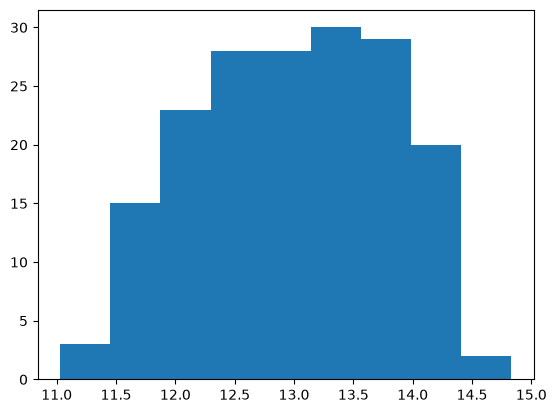
# Looks roughly normally distributed, so:
mu, sigma = st.norm.fit(alcohol)
x = np.linspace(np.min(alcohol)-0.5, np.max(alcohol)+0.5, 50)
plt.plot(x, st.norm(mu, sigma).pdf(x))
plt.hist(alcohol, density=True, bins=18)
plt.show()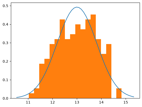
We have to admit that this distribution does not look particularly normal. You could almost make out a bimodal distribution – a mixture, that is, of two normal distributions with expected values near 12 and 13.5. Rather than go on guessing from the picture, let us note that we shall need a method for testing such guesses rigorously.
In our example we can press the class into service as an auxiliary variable:
alcohol_by_class = [alcohol[data[:,0] == c] for c in (1,2,3)]
# This is now a list of length 3,
#   each entry holding the alcohol values within one class.
for alcohol_class in alcohol_by_class:
    plt.hist(alcohol_class, density=True, bins=18)

plt.show()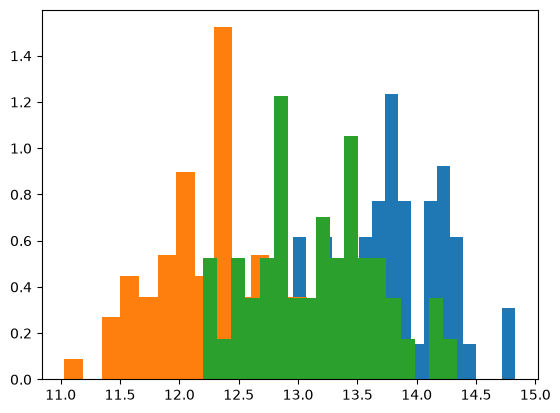
And indeed, clear differences show at once. The ‘blue’ wine (class 1) has more alcohol on average than the others, the ‘orange’ wine (class 2) less. Let us draw in the corresponding normal densities:
for alcohol_class in alcohol_by_class:
    plt.hist(alcohol_class, density=True, bins=18)

x = np.linspace(np.min(alcohol)-0.5, np.max(alcohol)+0.5, 50)
for alcohol_class in alcohol_by_class:
    mu, sigma = st.norm.fit(alcohol_class)
    plt.plot(x, st.norm(mu, sigma).pdf(x))

plt.show()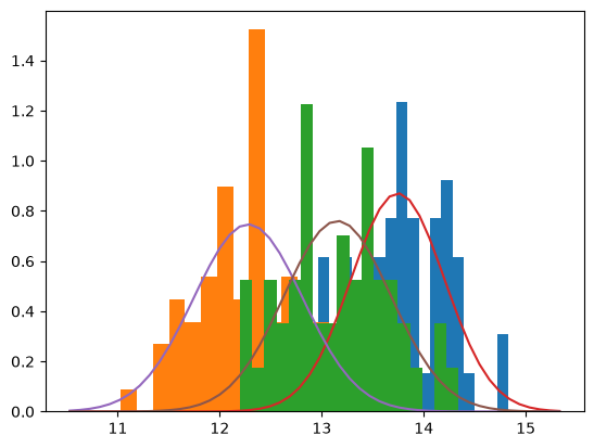
Unfortunately it is just as clear that the overlaps are so large that between 12 and 14.5 per cent alcohol by volume no sensible prediction of the class is possible.
For completeness we also model the mixture distribution:
class_frequencies = counts / len(alcohol) # (59/178, 71/178, 48/178)
params = [st.norm.fit(alcohol_class) for alcohol_class in alcohol_by_class]
pdfs = [st.norm(*param).pdf for param in params]

def mixed_alcohol(x):
    return sum((class_frequency * pdf(x)
                for class_frequency, pdf
                in zip(class_frequencies, pdfs)))

plt.plot(x, mixed_alcohol(x))
plt.hist(alcohol, density=True)
plt.show()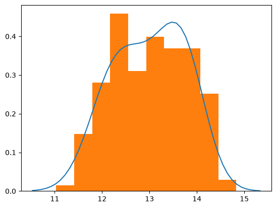
Having seen that the first attribute, the alcohol content, depends on the class, it is natural to examine all the other attributes the same way. So we rewrite the code generically and look at all the variables at once:
attributes_by_class = [[data[:,i][data[:,0] == c]
                        for c in (1,2,3)]
                       for i in range(1,14)]
# This is now a list of length 13,
#   each entry holding a list of length 3

# 13 plots with 3 histograms each:
for attribute in attributes_by_class:
    for attribute_class in attribute:
        plt.hist(attribute_class, density=True,
                 bins=18, alpha=0.7)
    plt.show()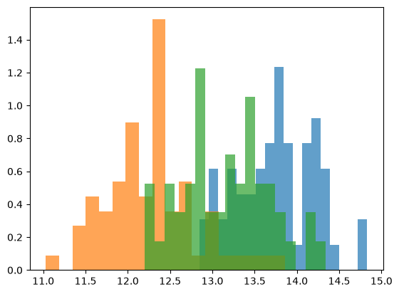
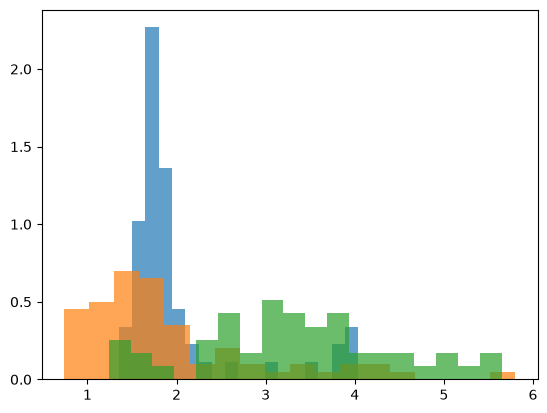
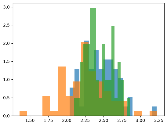
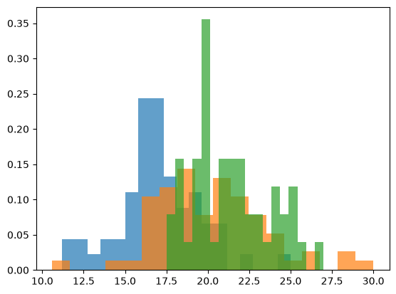
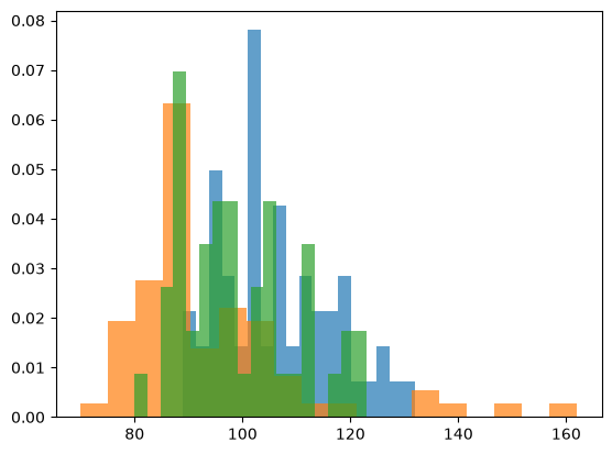
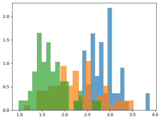
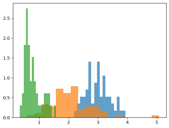
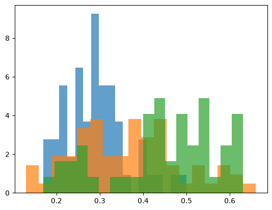
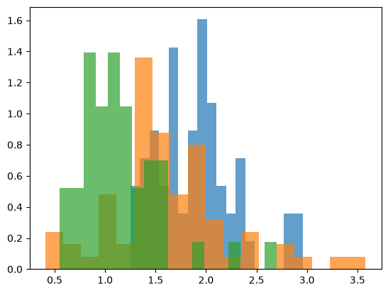
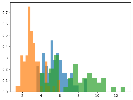
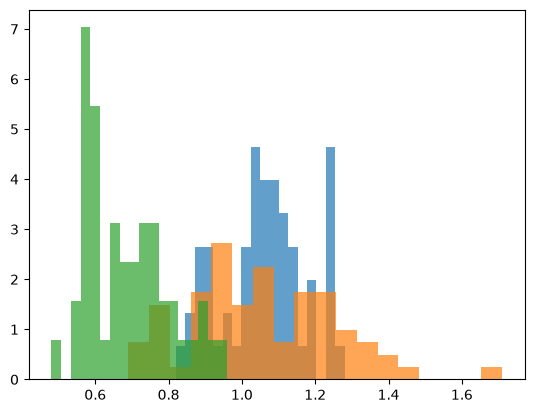
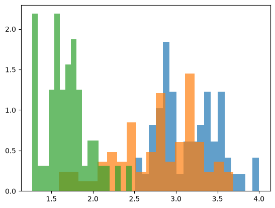
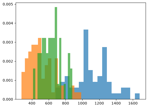
The pictures suggest that, besides attribute 1 (alcohol), attributes 2 (malic acid), 12 (OD280/OD315 of diluted wines, the protein content) and 13 (proline, an amino acid) might also serve to keep the classes apart.
# uses attributes_by_class
def plot_attribute_by_class(i, title=""):
    """use numbering from dataset, so alcohol = 1"""
    plt.title(title)
    attribute_by_class = attributes_by_class[i-1]
    attribute = data[:,i]
    xmin, xmax = np.min(attribute), np.max(attribute)
    for attribute in attribute_by_class:
        plt.hist(attribute, density=True, bins=18)
    x = np.linspace(xmin, xmax, 50)
    for attribute in attribute_by_class:
        mu, sigma = st.norm.fit(attribute)
        plt.plot(x, st.norm(mu, sigma).pdf(x))
    plt.show()

plot_attribute_by_class(1, "alcohol")
plot_attribute_by_class(2, "malic acid")
plot_attribute_by_class(12, "protein")
plot_attribute_by_class(13, "proline")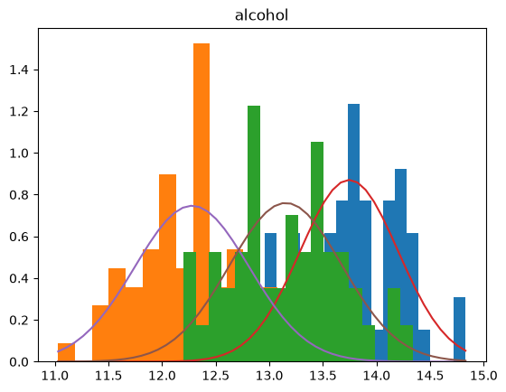
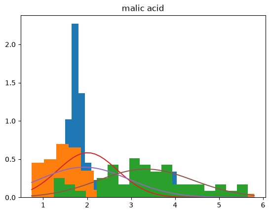
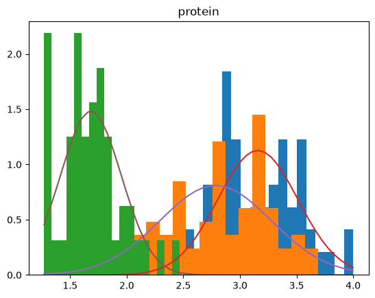
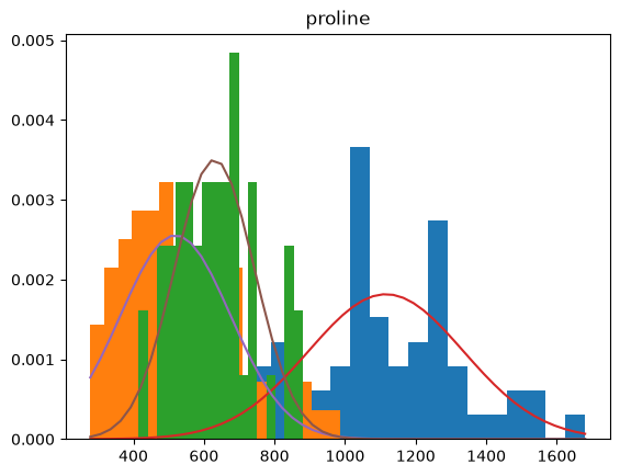
From this we see that malic acid is a rather poor indicator of the class, whereas protein and proline content together look considerably better suited to prediction than, say, the alcohol content. More precisely: protein content separates class 3 from classes 1 and 2, and proline content separates class 1 from classes 2 and 3. Neither separation is really clean, however, as the plot already shows.
Finally, we look at the relationship between individual attributes with a scatter plot:
plt.title("Alcohol content vs. malic acid")
plt.scatter(data[:,1], data[:,2])
plt.show()
plt.title("Protein vs. proline")
plt.scatter(data[:,12], data[:,13])
plt.show()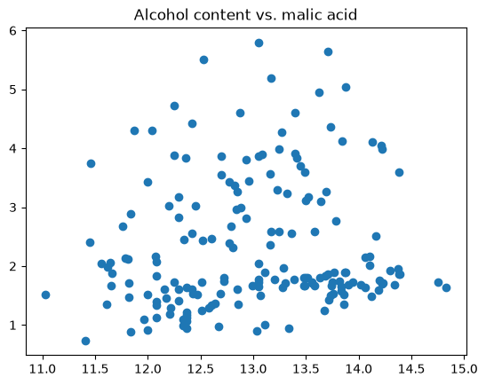
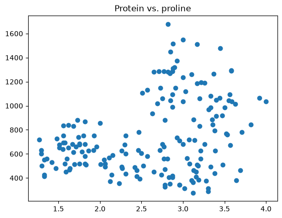
Whereas alcohol content and malic acid show no obvious relationship, the protein-proline plot has a pronounced white patch: a high proline content goes together with a high protein content. It would now be interesting to compute measures of this relationship, and also to search the specialist literature for an explanation of how it comes about.
To see whether the relationship is only apparent, and perhaps really arises from a dependence on the class, we look at the scatter plot once more, with the classes distinguished by colour:
plt.title("Protein vs. proline")
plt.scatter(data[:,12], data[:,13], c=data[:,0])
plt.show()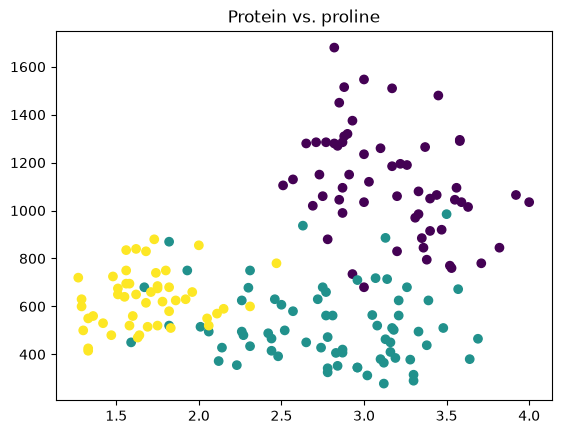
And indeed it is quite plain, as it was in the histograms before, that these two attributes taken together separate the classes reasonably well.
What we would like, of course, is a coordinate-independent procedure for separating the classes, so that we do not have to pick two variables by hand. Later, principal component analysis (PCA) will give us one.
Heavy rainfall events (CatRaRE)
The German weather service (DWD) makes data on heavy rainfall events available:
Catalogues of radar-based heavy precipitation events, as a basis for analysing heavy rainfall activity and its damage potential in Germany since 2001
The description of the datasets is to be found at the DWD (in German)
The metadata (a description of the attributes) are available as an XLSX (in German)
The data download links have to be cited whenever the data are used (in German)
Lengfeld, Katharina; Walawender, Ewelina; Winterrath, Tanja; Weigl, Elmar; Becker, Andreas (2021): Starkregenereignisse Version 2021.01 mit Überschreitung der DWD-Warnstufe 3 für Unwetter basierend auf RADKLIM-RW Version 2017.002,
DOI: 10.5676/DWD/CatRaRE_W3_Eta_v2021.01
url = "https://opendata.dwd.de/climate_environment/CDC/event_catalogues/germany/precipitation/CatRaRE_v2021.01/data/CatRaRE_2001_2020_W3_Eta_v2021_01.csv"
# Column types of the 60 columns in the order of the CSV header row, following CatRaRE's metadata table:
# i8 = integer, f8 = floating-point number, S10/S23/... = string with that maximum length
data = np.genfromtxt(url, delimiter=",", names=True,
                     dtype="i8,S10,S10,i8,i8,i8,S23,S23,i8,i8,f8,f8,f8,i8,i8,i8,i8,i8,i8,S23,S23,S23,f8,f8,f8,S12,S12,i8,i8,i8,i8,S6,i8,S6,i8,i8,f8,i8,i8,i8,f8,i8,i8,i8,i8,f8,f8,f8,i8,f8,i8,i8,i8,i8,i8,f8,i8,f8,f8,f8,f8")
data[0]
np.void((1, b'W3_Eta_v20', b'W3_Eta_1', 1, 200101020350, 200101020750, b'2001-01-02T03:49:59.000', b'2001-01-02T07:50:00.000', 4, 51, 44.6, 51.0, 100.0, 1, 286, 183, -157462, -4575645, 8315037, b'Baden-W\xfcrttemberg', b'Breisgau-Hochschwarzwal', b'Feldberg (Schwarzwald)', 2.6, 51.5, 38.0, b'28', b'4', 5, 3, 0, 19, b'SWAZF', 19, b'SWAZF', 19, 12, 16.5, 20, 29, 19, 24.8, 30, 6, 620, 21, 0.1, 0.5, 64.9, 0, 0.4, 85, 312, 312, 1187, 585, 1102.3, 1462, -26.1, -311.9, -8.6, 223.5), dtype=[('OBJECTID', '<i8'), ('CatVersion', 'S10'), ('KEY_FIELD', 'S10'), ('Event_ID', '<i8'), ('Start_Time', '<i8'), ('End_Time', '<i8'), ('Date_START', 'S23'), ('Date_END', 'S23'), ('Duration', '<i8'), ('Area', '<i8'), ('Area_LAEA', '<f8'), ('Area_in_G', '<f8'), ('AShare_in_G', '<f8'), ('RRmax_in_G', '<i8'), ('x_RRmax', '<i8'), ('y_RRmax', '<i8'), ('x_RRmaxPRJ', '<i8'), ('y_RRmaxPRJ', '<i8'), ('AGS_RRmax', '<i8'), ('BDL_RRmax', 'S23'), ('LKS_RRmax', 'S23'), ('GMD_RRmax', 'S23'), ('Eta', '<f8'), ('RRmax', '<f8'), ('RRmean', '<f8'), ('Tmax', 'S12'), ('Tmean', 'S12'), ('SRImax', '<i8'), ('SRImean', '<i8'), ('MPP_flag', '<i8'), ('WL_START', '<i8'), ('WLc_START', 'S6'), ('WL_END', '<i8'), ('WLc_END', 'S6'), ('V3_RRmax', '<i8'), ('V3_MIN', '<i8'), ('V3_AVG', '<f8'), ('V3_MAX', '<i8'), ('V4_RRmax', '<i8'), ('V4_MIN', '<i8'), ('V4_AVG', '<f8'), ('V4_MAX', '<i8'), ('BVLK_RRmax', '<i8'), ('BVLK_SUMME', '<i8'), ('BVLK_D1km2', '<i8'), ('SDL_RRmax', '<f8'), ('SDL_GRAD', '<f8'), ('SDL_MAX', '<f8'), ('VSGL_RRmax', '<i8'), ('VSGL_GRAD', '<f8'), ('VSGL_MAX', '<i8'), ('CLC_RRmax', '<i8'), ('CLC_DOMIN', '<i8'), ('SRTM_RRmax', '<i8'), ('SRTM_MIN', '<i8'), ('SRTM_AVG', '<f8'), ('SRTM_MAX', '<i8'), ('TPI_RRmax', '<f8'), ('TPI_MIN', '<f8'), ('TPI_AVG', '<f8'), ('TPI_MAX', '<f8')])print(np.max(data["RRmax"]), np.min(data["RRmean"]))
print(np.mean(data["Duration"]))462.0 25.6
5.051172893136403
Now we have to settle on a research question. One question is always obvious: what distribution do the variables have? We can once again look at the bare frequency, that is, at how the points in time are distributed. We could follow it over the years, or average over the years and analyse how the month influences the frequency. The latter suggests itself: heavy rain is a weather phenomenon and so depends on the seasons, and we can expect a clear relationship.
At the moment the start time of a heavy rainfall event is encoded as an int. We turn that to our advantage: make a string out of the int 200101020350 and extract the month from it:
def getmonthfromintdate(intdate):
    return int(str(intdate)[4:6])

assert getmonthfromintdate(200101020350) == 1

def getmonthcount(data, month):
    mask = [getmonthfromintdate(intdate) == month
            for intdate in data["Start_Time"]]
    return len(data[mask])

months = np.arange(1,13)
counts = np.array([getmonthcount(data, month)
                   for month in months])
densities = 100 * counts / len(data)
plt.title("Share of the month in all heavy rainfall events, in per cent")
plt.bar(months, densities, width=1)
plt.show()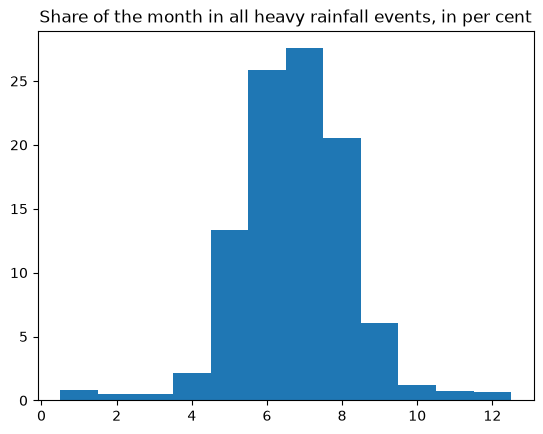
So the expected relationship shows clearly: in July and June heavy rainfall events are considerably more frequent than in winter.
Next we can look at the location, say at the variable GMD_RRmax and the place "Düsseldorf":
# Does not work:
duessel = data[data["GMD_RRmax"] == "Düsseldorf"]
len(duessel)0# Instead:
for entry in data["GMD_RRmax"]:
if("sseldorf" in str(entry)):
print(entry)
break
b'D\xfcsseldorf'
# So (b'...' is a byte string: genfromtxt reads text columns as bytes;
#  with pandas.read_csv, see the chapter Pandas, they would be ordinary strings):
city = b'D\xfcsseldorf'
citydata = data[data["GMD_RRmax"] == city]
print(len(citydata))
citycounts = np.array([getmonthcount(citydata, month)
                       for month in months])
plt.bar(months, citycounts, width=1)
plt.show()
7
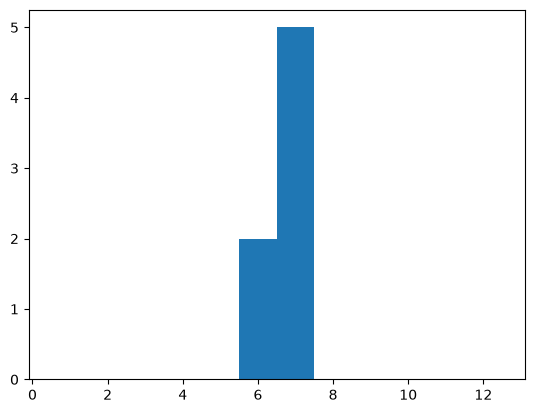
We see that in Düsseldorf, June and July have so far been the only months with heavy rainfall events.
Seven events are too few for looking at further correlations, so there is little to be gained from staying with Düsseldorf.
To get an impression of the spatial distribution, we look at a scatter plot of the locations of maximum precipitation in the RADKLIM grid (x_RRmax, y_RRmax):
plt.scatter(data["x_RRmax"], data["y_RRmax"])
plt.show()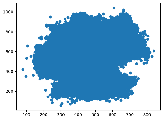
You can almost make out Germany – and, above all, that the y axis needs rescaling. So we read up on the scaling of the RADKLIM grid and learn that every grid point corresponds to exactly . The plot therefore merely has to be square. To see a little more of the distribution, we also make every point partly transparent. Large clusters then become visible:
plt.rcParams["figure.figsize"] = (10,10)
plt.scatter(data["x_RRmax"], data["y_RRmax"], alpha=0.1)
plt.show()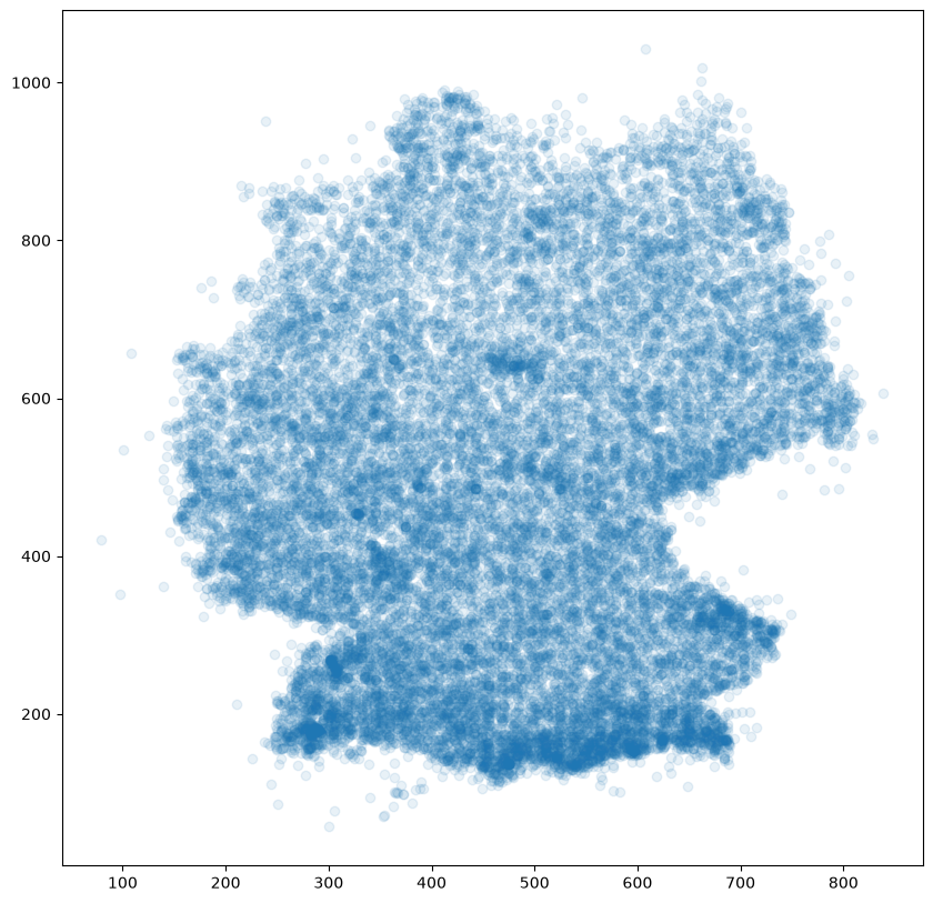
This shows that heavy rainfall events are more frequent in the south than in the north. We might also suspect a relationship with the duration (Duration) of the events:
plt.scatter(data["Duration"], data["y_RRmax"], alpha=0.01)
plt.show()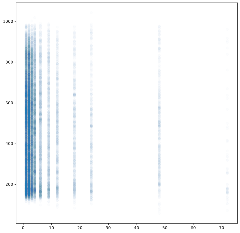
Instead of the suspected relationship we see something else entirely: the duration is mostly a single-digit number, and longer events are rather rare. We can bring in the spatial relationship as well by distinguishing by colour:
plt.scatter(data["x_RRmax"], data["y_RRmax"],
            alpha=0.9, c=data["Duration"],
            cmap="ocean")
plt.colorbar()
plt.show()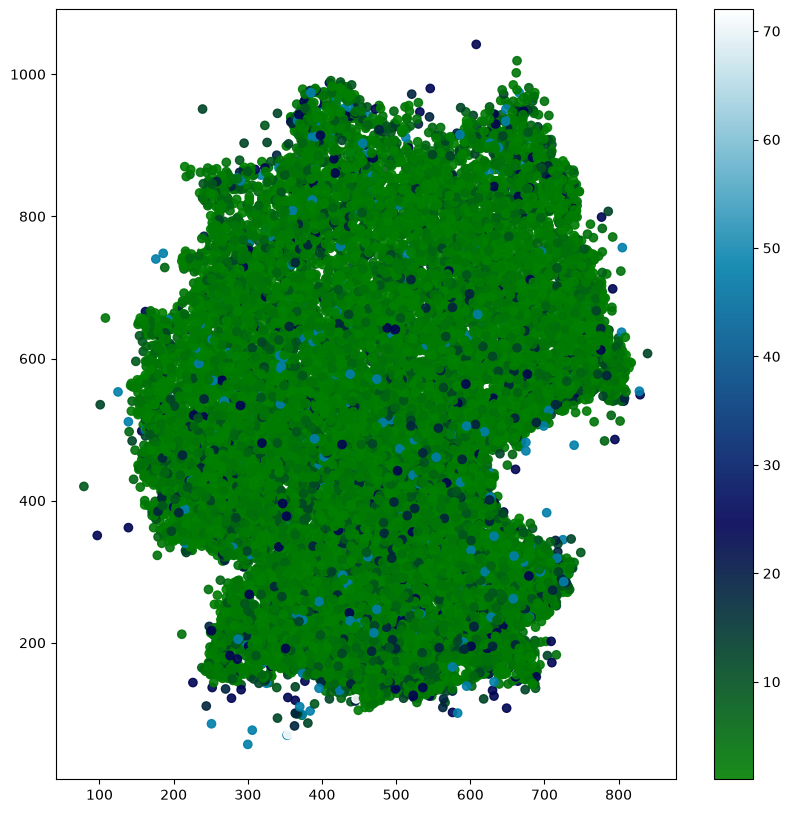
Since there is not much to see here (apart from the rarity of longer events), we look at the analogous plot for the mean precipitation:
plt.scatter(data["x_RRmax"], data["y_RRmax"],
            alpha=0.9, c=data["RRmean"],
            cmap="ocean")
plt.colorbar()
plt.show()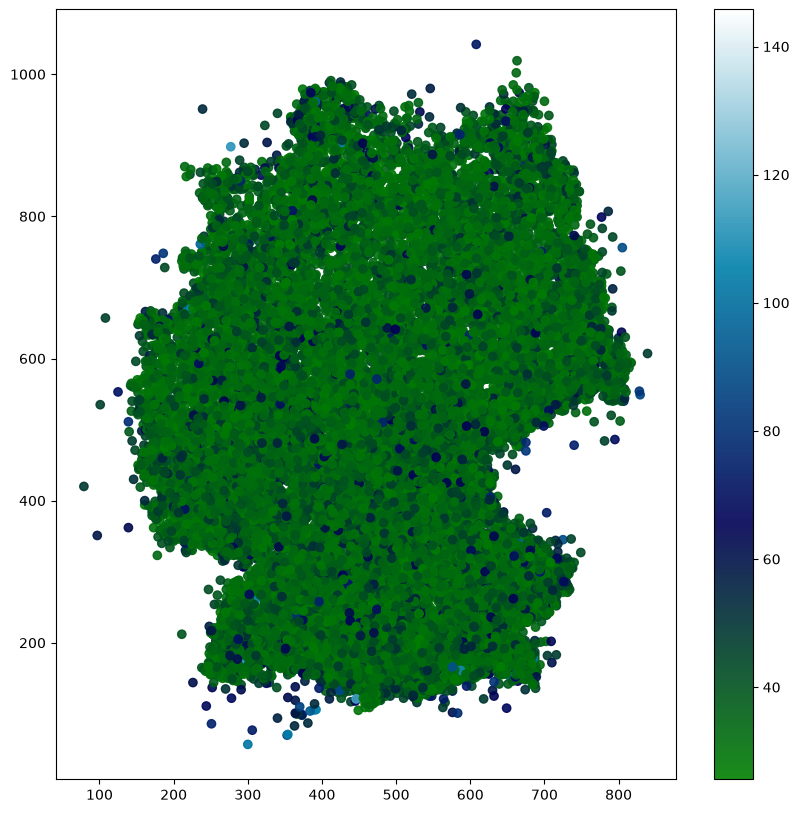
Here we begin to suspect that the scale is hard to read because the more extreme events (in light blue) take up so much of it. Excluding those events shows more:
calm_data = data[data["RRmean"] < 60]
plt.scatter(calm_data["x_RRmax"], calm_data["y_RRmax"],
            alpha=0.9, c=calm_data["RRmean"],
            cmap="ocean")
plt.colorbar()
plt.show()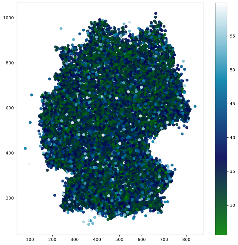
But we get the same effect by adjusting the colormap instead:
from matplotlib import colormaps
from matplotlib.colors import ListedColormap
top = colormaps['ocean'].resampled(128)
bottom = colormaps['Oranges'].resampled(128)
newcolors = np.vstack((
    top(np.linspace(0, 1, 128)),
    bottom(np.linspace(0, 1, 128))
))
my_colormap = ListedColormap(newcolors, name='My Colormap')
plt.scatter(data["x_RRmax"], data["y_RRmax"],
            alpha=0.9, c=data["RRmean"],
            cmap=my_colormap)
plt.colorbar()
plt.show()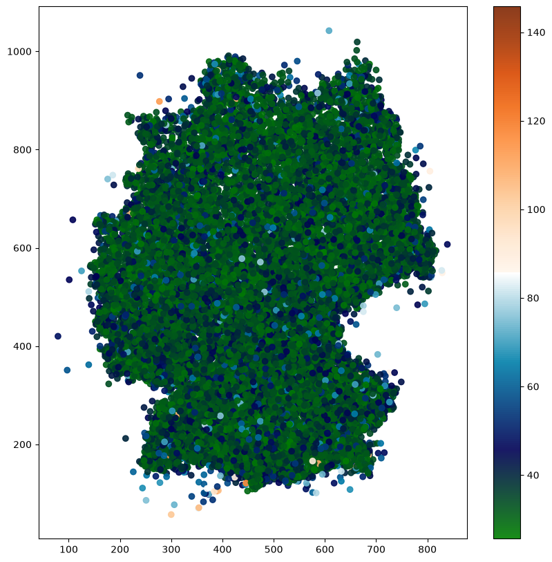
That will do on heavy rainfall events for now.
Titanic
Now we get to know matplotlib’s object-oriented interface, using the Titanic dataset. On Kaggle it is part of a ‘competition’.
We download the training dataset as titanic.csv.
# This will not work (pandas.read_csv understands quotation marks and
#  reads this file directly, see the chapter Pandas):
try:
    data = np.genfromtxt("titanic.csv",
                         delimiter=",", names=True)
except ValueError:
    print("Problem: ',' in the field 'Name'")
Problem: ',' in the field 'Name'
# We skip the first line and pretend
#   the name consisted of two columns.
data = np.genfromtxt("titanic.csv",
                     delimiter=",", skip_header=1,
                     usecols=(1,2,5,6,7,8),
                     dtype="i8,i8,S10,i8,i8,i8",
                     names=("Survived","Pclass","Sex",
                            "Age","SibSp","Parch"))
data[:4]
array([(0, 3, b'male', 22, 1, 0), (1, 1, b'female', 38, 1, 0),
(1, 3, b'female', 26, 0, 0), (1, 1, b'female', 35, 1, 0)],
dtype=[('Survived', '<i8'), ('Pclass', '<i8'), ('Sex', 'S10'), ('Age', '<i8'), ('SibSp', '<i8'), ('Parch', '<i8')])print("Total survivors:", np.sum(data["Survived"]))
print("Total passengers:", len(data))
print("Survival rate:", np.sum(data["Survived"]) / len(data))Total survivors: 342
Total passengers: 891
Survival rate: 0.3838383838383838
# Missing data:
data["Age"][:10]
array([22, 38, 26, 35, 35, -1, 54, 2, 27, 14])aged_data = data[data["Age"] != -1]
print("Wrong mean:", np.mean(data["Age"]))
print("Correct mean:", np.mean(aged_data["Age"]))Wrong mean: 22.85409652076319
Correct mean: 29.847605224963715
# Age correlated with survival?
nonsurvivors, survivors = tuple(aged_data[aged_data["Survived"] == i]
                                for i in range(0,2))
print(np.mean(survivors["Age"]), np.mean(nonsurvivors["Age"]))
29.01418439716312 30.425061425061426
fig, ax = plt.subplots()

def ageplot(data, ax):
    ax.set_xlabel("Age [years]")
    ax.set_ylabel("Frequency")
    ages = np.arange(0,99)
    count = np.array([len(data[data["Age"] == age])
                      for age in ages])
    ax.bar(ages, count, alpha=0.6)
    ax.set_xticks(np.linspace(0, 99, 12))

ageplot(survivors, ax)
ageplot(nonsurvivors, ax)
plt.show()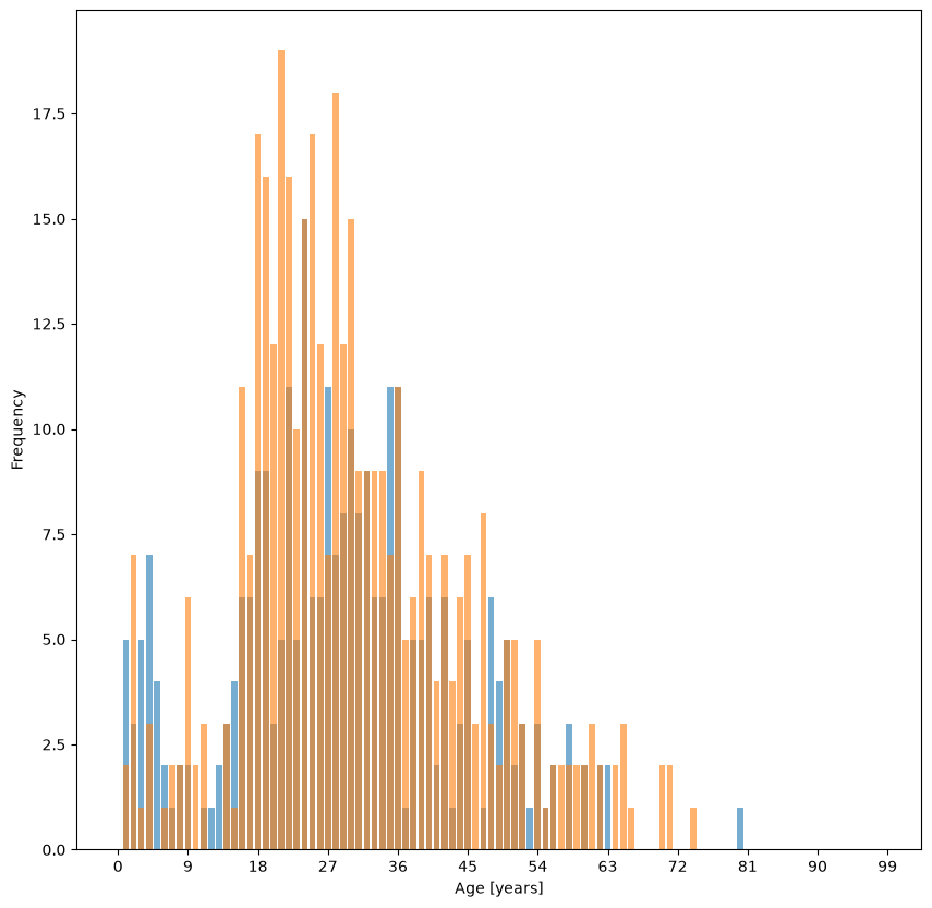
fig, ax = plt.subplots()
pclasses = (aged_data[aged_data["Pclass"] == i]
            for i in np.arange(1,4))
for pclass in pclasses:
    ageplot(pclass, ax)

plt.show()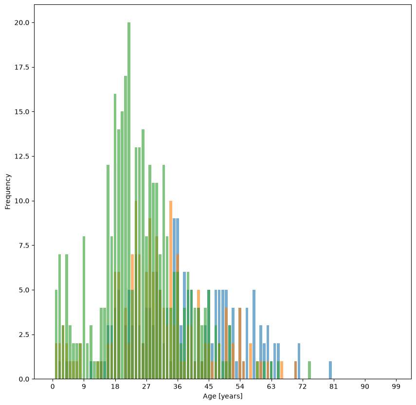
It is hardly surprising that in class 3 (the cheapest, in green) the ages tend to be lower than in the other classes. In passing we also notice that class 3 is more frequent than the others (which should perhaps not surprise us either).
To see whether passenger class and survival are related, a scatter plot is enough:
fig, ax = plt.subplots(figsize=(3,3))
ax.scatter(data["Pclass"], data["Survived"], alpha=0.005)
plt.show()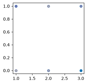
The scatter plot shows a correlation: passengers in class 3 more often did not survive, and passengers who survived were more often in class 1. It was only visible, however, because we set alpha = 0.005, and it suffers from ignoring the absolute frequencies of the classes (a base rate fallacy).
The correct thing to do here is to compute the probability that a passenger in class 3 survived:
psp_mask = [(data["Survived"] == 1) & (data["Pclass"] == c)
        for c in np.arange(1,4)]
p_mask = [(data["Pclass"] == c)
          for c in np.arange(1,4)]
total_pclass_counts = [len(data[p_mask[c]])
       for c in np.arange(0,3)]
psp = [len(data[psp_mask[c]]) / total_pclass_counts[c]
       for c in np.arange(0,3)]
for c in range(3):
    print("P( Survived = 1 | Pclass =",c+1,") =", psp[c])
P( Survived = 1 | Pclass = 1 ) = 0.6296296296296297
P( Survived = 1 | Pclass = 2 ) = 0.47282608695652173
P( Survived = 1 | Pclass = 3 ) = 0.24236252545824846
We see that a first-class passenger was considerably more likely to survive than to die. For second-class passengers the odds are already worse than 50/50, and fewer than a quarter of third-class passengers survived.
It should not surprise us that these probabilities do not sum to 1: they refer to different populations. For the reverse conditional probability, on the other hand, we do expect a sum of 1:
total_survivor_count = len(data[data["Survived"] == 1])
pps = [len(data[psp_mask[c]]) / total_survivor_count
       for c in np.arange(0,3)]
for c in range(3):
    print("P( Pclass =",c+1,"| Survived = 1 ) =", pps[c])

assert np.isclose(sum(pps), 1)   # never compare floating-point numbers exactly
P( Pclass = 1 | Survived = 1 ) = 0.39766081871345027
P( Pclass = 2 | Survived = 1 ) = 0.2543859649122807
P( Pclass = 3 | Survived = 1 ) = 0.347953216374269
This shows that survival status certainly does not tell us which class someone travelled in (because the passengers are not spread evenly over the classes). The two directions and are tied together by the class frequencies; exactly how is the business of Bayes’ theorem in the chapter Covariance and dependence, and the chapter Titanic EDA works the same thing through for the variable Sex.
It is always interesting how representative a sample is, because that tells us how far the relationships we have found might generalise. So we now look at whether the variable Sex is correlated with other variables. Admittedly we do not yet know what we are doing, but let that be motivation for learning later what it was we did:
try:
    st.pearsonr(data["Sex"], data["Age"])
except ValueError as e:
    print(str(e))
could not convert string to float: np.bytes_(b'male')
sexbool = (data["Sex"] == b"female")
r, pvalue = st.pearsonr(sexbool, data["Age"])
print(r, pvalue)
-0.003542250865523883 0.9159102368544852
The second return value, pvalue, is a p-value: the probability, for two variables that really are uncorrelated, of seeing a correlation coefficient at least as far from 0 as ours. Here it is 0.92, so an like this would be perfectly ordinary for uncorrelated data: the sample cannot tell the tiny deviation from 0 apart from sampling error. That is all the p-value says – in particular, it does not say how likely it is that sex and age are uncorrelated. What a p-value is and is not is settled in the chapter Statistical tests.
print(st.pearsonr(sexbool, data["Survived"]))PearsonRResult(statistic=np.float64(0.5433513806577556), pvalue=np.float64(1.4060661308798955e-69))
Here we clearly see , and a vanishingly small probability of observing such an for data that are in fact uncorrelated.
print(st.pearsonr(sexbool, data["Pclass"]))
print(st.pearsonr(sexbool, data["Age"]))
print(st.pearsonr(sexbool, data["SibSp"]))
print(st.pearsonr(sexbool, data["Parch"]))
PearsonRResult(statistic=np.float64(-0.1319004906047393), pvalue=np.float64(7.850524283810112e-05))
PearsonRResult(statistic=np.float64(-0.003542250865523883), pvalue=np.float64(0.9159102368544852))
PearsonRResult(statistic=np.float64(0.1146308103894224), pvalue=np.float64(0.0006076214735498901))
PearsonRResult(statistic=np.float64(0.24548896009069918), pvalue=np.float64(1.0739326016045421e-13))
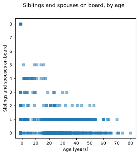
So, naively (following the Scipy Stats documentation), we expect the variable SibSp to be correlated with sex. According to the metadata, SibSp is the number of siblings and spouses travelling with the passenger. Age, too, shows a correlation with SibSp:
print(st.pearsonr(data["Age"], data["SibSp"]))
fig, ax = plt.subplots(figsize=(5,5))
fig.suptitle("Siblings and spouses on board, by age")
ax.scatter(data["Age"], data["SibSp"],
           alpha=0.5, marker="s")
ax.set_xlabel("Age [years]")
ax.set_ylabel("Siblings and spouses on board")

plt.show()
PearsonRResult(statistic=np.float64(-0.16434928321340586), pvalue=np.float64(8.120291402857697e-07))